The story behind the Golden Analytics logo
Our logo isn't arbitrary. It's built from the same mathematical principles that shape sunflower spirals and nautilus shells — and that's exactly the point.

Every brand decision is a choice about what to say first.
When we started Golden, we wanted to build something that felt different — tools that put the beauty of insight front and center, with the machinery underneath where it belongs. We brought in Paper Crane Factory to design the mark. What they built captures that idea directly.
Built from the Golden Ratio
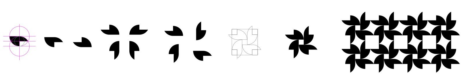
The first instinct was to sketch around the lowercase “g.” Clean, predictable. The team scrapped it almost immediately.
What emerged instead is a symbol built from perfect circles, intersections, quadrants, and carefully measured geometry. Four shapes converge inside a perfect square, forming something that looks like a bloom. It feels alive, not engineered.
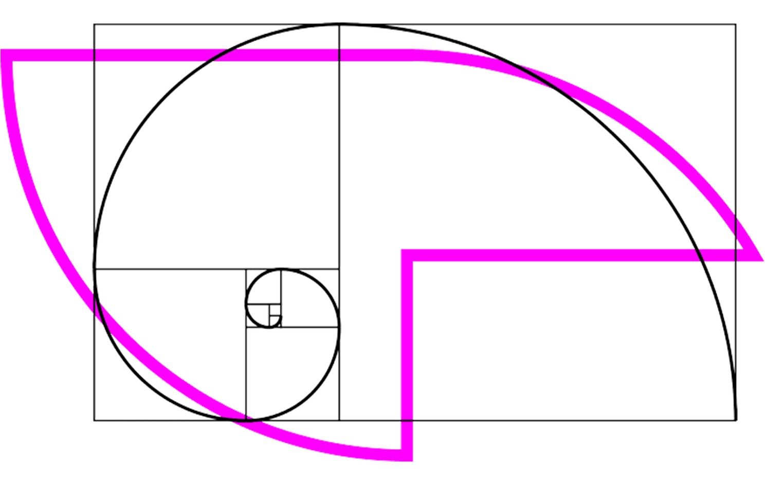
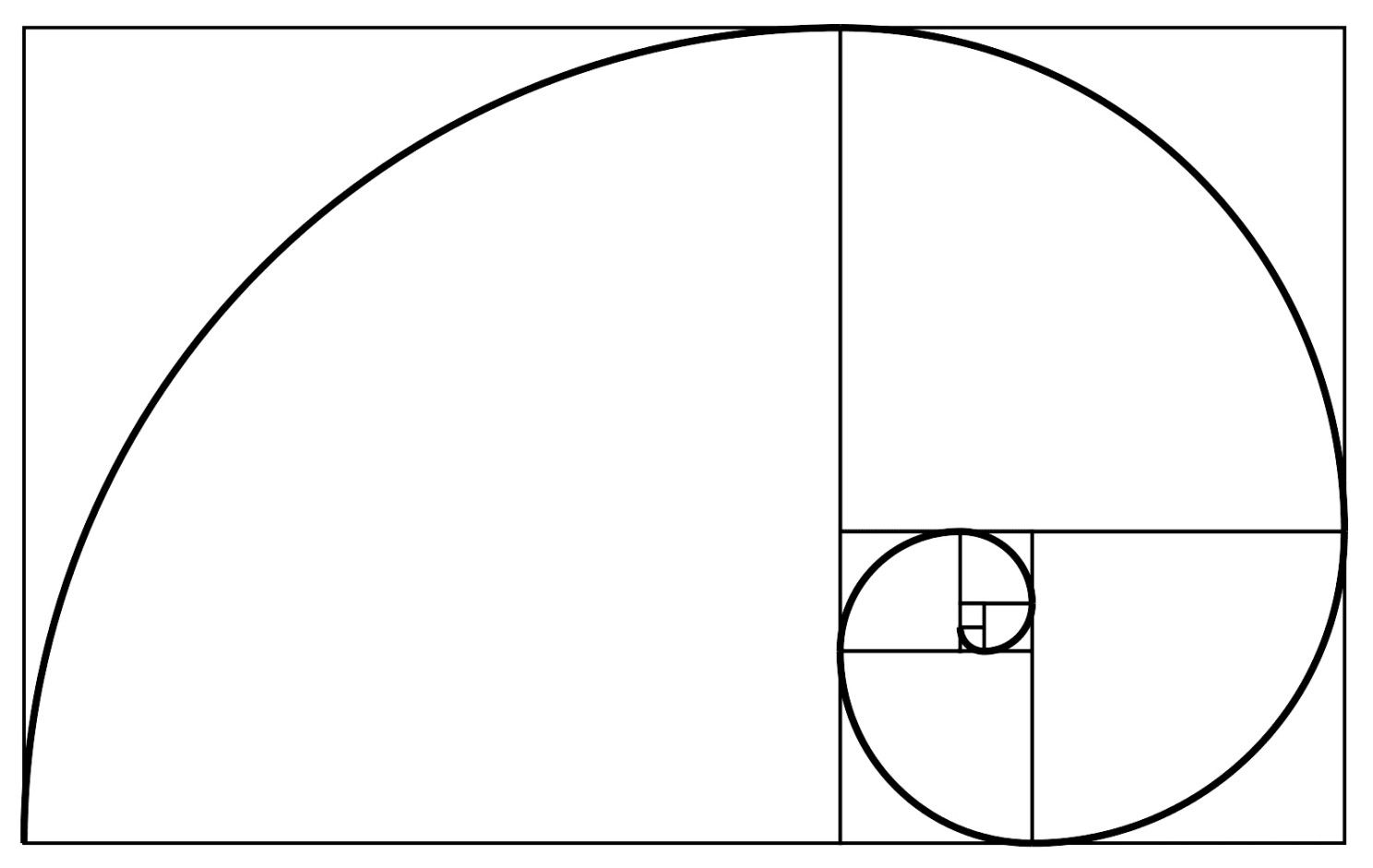
The inspiration was the Golden Ratio — not as a design gimmick, but as a genuine starting point. A sunflower’s seed spiral follows Fibonacci. A nautilus shell traces a logarithmic curve. The mathematics is there, embedded in nature. What you see is the pattern it produces.

The Invisible Infrastructure
The same logic applies to how we think about analytics.
Formulas, joins, aggregations — the underlying work of data — are infrastructure. They exist to produce something: a cleaner chart, a sharper insight, a better decision. The analysts and business leaders who use those outputs are the ones who matter. The calculations are supposed to serve them quietly.
Most analytics interfaces lead with the machinery. Golden leads with the bloom. The math is underneath, working as it should — invisibly, so the result can speak.
We think about it like a car. What you experience in the driver’s seat is performance, handling, feel. The engineering that makes it possible stays under the hood.
The Team
Getting a brand right takes real craft. We’re grateful to Paper Crane Factory and to the Golden team who shaped it:
- Will Hays — Head of Brand
- Caroline Edwards — Head of UI/UX and Product
- Dee Dee Jones — Head of Creative Operations
- Stephanie Rogers — Head of Comms and PR
- Caroline Goles — Launch Lead
this post was originally published on LinkedIn at https://www.linkedin.com/pulse/bts-golden-analytics-cal-mcallister-slrfc/