Time Series Analytics Made Easy
There are only four questions anyone asks of a time series. What happened. Why it happened. What might happen next. What changed since last time. Here's how Golden answers each one in a click.
Every business question is a time question.
Did we grow? Compared to when? Is that dip normal for a Tuesday in August, or is something actually broken? Will next quarter look like this one?
Date is the column everyone drags onto a chart first, and it's the one most tools handle worst. You get a line. The line goes down. Then you spend the rest of the afternoon in a spreadsheet working out why.
Most questions about a time series boil down to four things: What happened. Why it happened. What might happen next. What changed since last time. We built Golden's time series around those four, and each one is a single step.
What happened
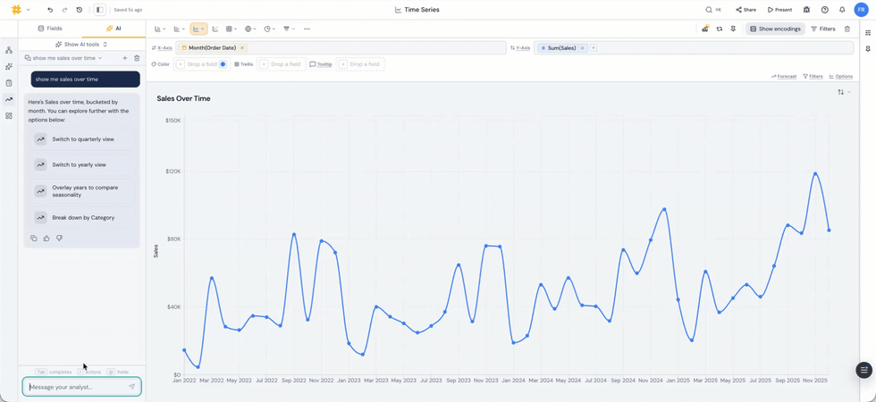
A year is a useful unit right up until it isn't. Golden reads your date field and lets you move through granularity the way you'd zoom a map. Year, quarter, month, week, day, hour, minute, second. No new field is needed to be created and no re-query on your part.
That matters more than it sounds. Quarterly, sales look like a clean staircase up and to the right. Monthly, the same data is a sawtooth with a hard collapse every January. Same numbers, two completely different conversations with your boss.
Support tickets look steady by week and pile up between 4pm and 6pm every weekday. Nobody finds that at the month grain.
Date parts work the same way. Pull the month out across every year, or the day of week, and ask whether Fridays have always been like this or only since March.
Then there's the math. Dates aren't just an axis, they're something you calculate with.
Golden handles durations between two dates in seconds, minutes, hours, days, weeks, months, or years, formatted the way a human would say it. Signup to first purchase. Order to delivery. Ticket opened to ticket closed. First touch to closed won.
On top of that: change versus the prior period, change versus the same period last year, running totals, moving windows, percent of total across a period.
You pick the fields and the period. Golden writes the expression. If you've ever nested a DATEDIFF inside a CASE inside a calculated field just to answer "how long does this usually take," you know exactly what we simplified.
Why it happened
Sales are down 12%. Great. Down where?
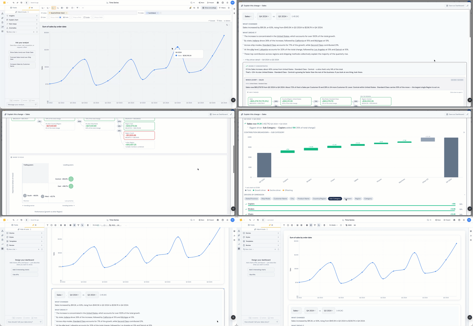
Every chart in Golden has an Explain chart button sitting next to it. One click and Golden pulls the change apart.
Which segments moved. How much each contributed to the total, in real units, not a vague ranking. Which ones were quietly growing while everything else fell. Whether the damage is concentrated in one place or spread thin across everything, which is the difference between a fixable problem and a market.
You get a full analysis, not just a number. What changed, what contributed, the ranked drivers, and where to focus next. A waterfall stacks each contribution up to the total move, so the story reads left to right: this segment took 8 points out, this one gave 2 back, there's your 12.
Anomalies run alongside it, flagging the points in the series that don't belong, and Next steps proposes the follow-up question before you've thought of it.
This is the part that used to burn a ton of time. An analyst slices by region, then product, then channel, then region and channel together, rebuilding the same pivot eleven times hunting for the cut that explains it. Golden runs those cuts on your behalf and hands back the ones that mattered.
What might happen next
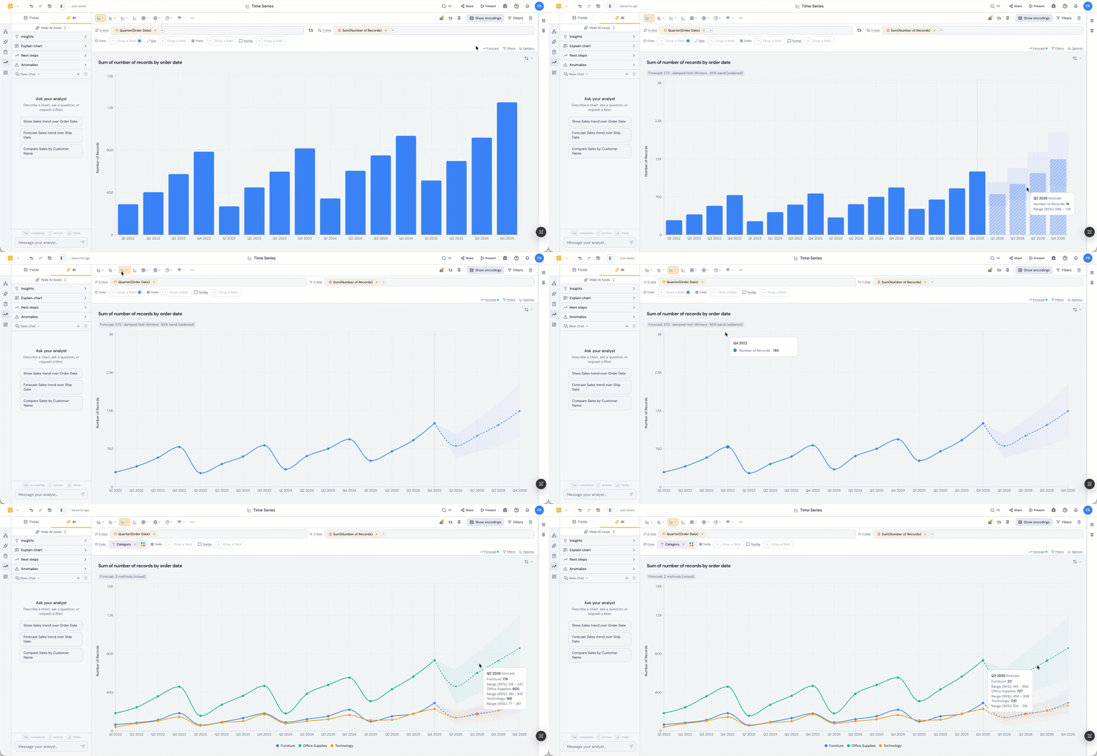
There's a Forecast button on the chart. Click it and Golden runs the forecast forward.
Under the hood it's exponential smoothing with damped trend and seasonality, and it picks the model to fit your data instead of making you pick. Real weekly or monthly season, it uses it. No season, it says so and steps down to a simpler model rather than inventing one. History too short or too noisy to forecast honestly, it won’t create the forecast.
You get the shape, the direction, and prediction intervals at 80, 90, or 95%. The intervals are the honest part. Golden backtests the model against your own history and widens the bands when it's been wrong before, so the range reflects how your series actually behaves rather than a textbook assumption.
The point was never a precise number for March. It's knowing whether you're trending toward the target or away from it, and how much room the data leaves for either.
What changed since last time
The best analysts are the ones who remember which question to ask. Golden puts those questions on the screen.
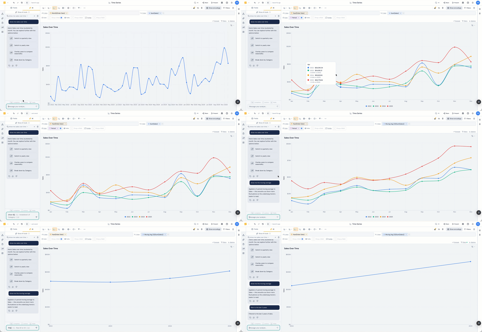
Ask for sales over time and the answer comes back with the next moves attached: switch to quarterly, switch to yearly, overlay years to compare seasonality, break down by category. You're never staring at a line wondering what to do with it.
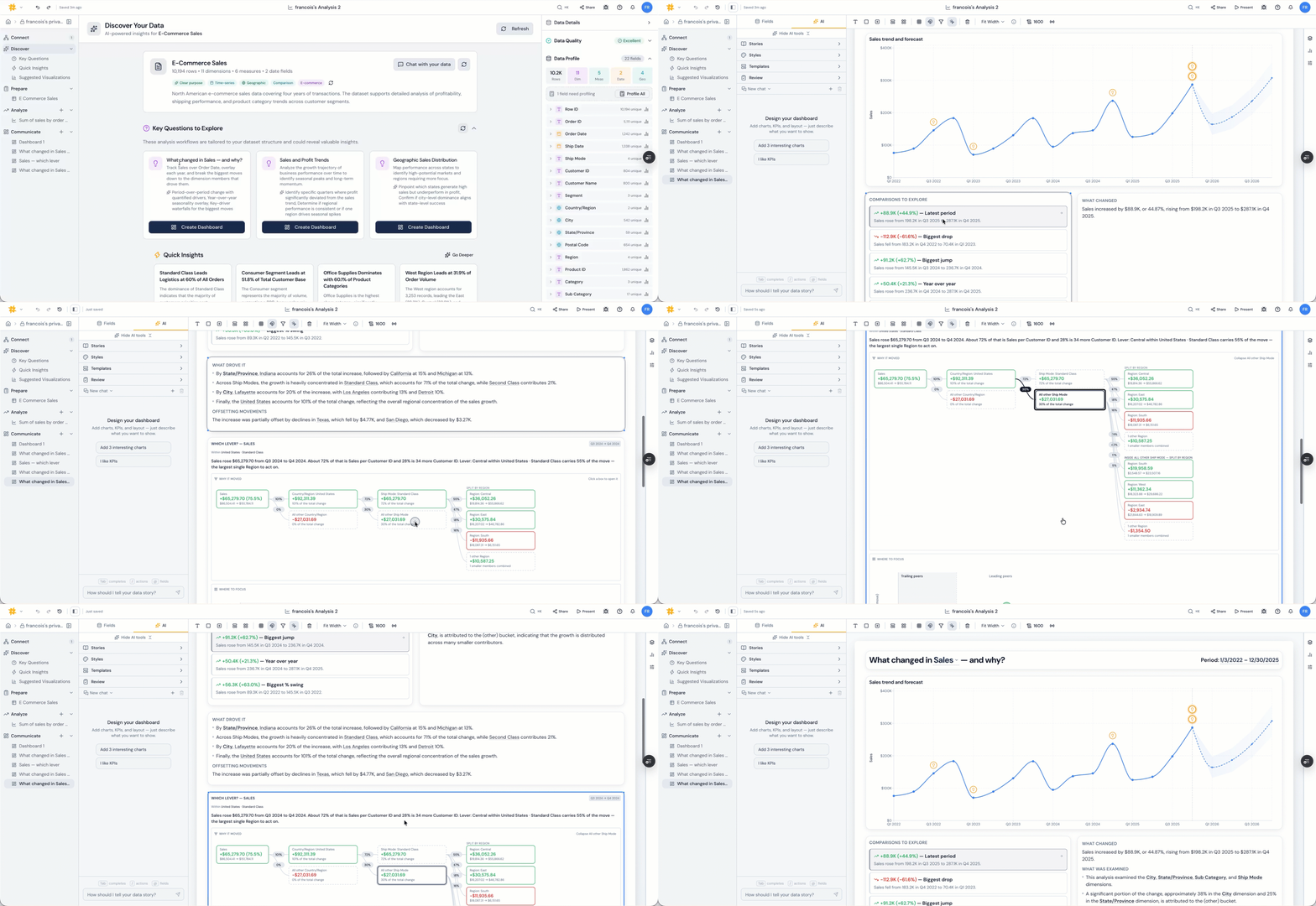
Discover goes further and proposes whole analyses against your dataset. "What changed in Sales, and why?" is one of them, and it builds a dashboard with period-over-period change and quantified drivers, a year-over-year seasonality overlay, and key-driver waterfalls for the biggest moves.
The year-over-year overlay puts this year's line on top of last year's, so seasonality stops masquerading as a trend.
Why any of this matters
Analysts have always been able to do all of this. That was never the problem. The problem was that each answer cost half a day, so most of them never got asked.
A PM wondering whether last week's dip is seasonal doesn't file a ticket and wait for a chart. They click. Then they ask the second question, and the third, and that's usually where the good stuff lives.
That's the whole idea. Make the questions cheap, and people start asking better ones.