
Tag
Headline is Here
This is the story content. Lorem ipsum dolor sit amet consectetur adipiscing elit. Quisque faucibus ex sapien vitae pellentesque sem placerat. In id cursus mi pretium tellus duis convallis.
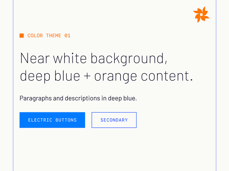
We aren’t another analytics company. We don’t blend into the sea of sameness. We’re building something new, fresh, and empowering. As a brand we revolutionize every moment no matter the stage- from the smallest email signature to the largest event stage. Across physical, digital, and spoken touch points. When people see our brand, when they meet us, they feel the revolution.
Let's begin with these core brand attributes:
Golden Analytics is a data intelligence company. Its visual identity balances precision with warmth — structured grids and technical typography coexist with organic imagery and a palette that feels both premium and alive.
The identity operates in two registers: brand (expansive, editorial, rich) and product (clean, functional, information-dense). Every touchpoint is defined by the tension between these two modes.
Golden Analytics uses three distinct marks. Each serves a specific role and context. They are never combined in a single composition. Use Orange marks as the primary colorway on light and dark backgrounds, except for pure black backgrounds, where white logos are preferred. Black logos are only to be used when required by the context, such as single color print or black and white mediums.

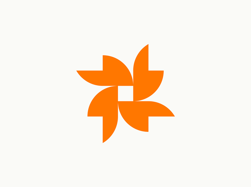
A sunflower's seed spiral is Fibonacci. A nautilus shell is a logarithmic curve. A beehive is hexagonal tiling at the millimeter scale. Immense amounts of math, compressed into something you'd call beautiful before you'd call mathematical. The data does the work underneath. The living thing on top gets to be the rock star. Our logo is built with the same principles: it is formed through the symmetrical combination of mathematically perfect circles, whose intersections reveal a petal, repeated four times, aligned perfectly within a square unit. It stands alone as a visual encapsulation of our brand ethos, encoded into our core identity.
Used as a standalone identifier — app icons, favicon, embossed marks, profile photos, and any context where the word mark is impractical. The icon is always presented at equal height and width; it is never stretched or used at sizes below 24px. It never spins like a pinwheel or a throwing star.
The Flower logo pairs with the "Golden Analytics" word mark in a horizontal arrangement to form the full word mark. "Golden" is set in a complimentary typeface to the flower icon, matching its weight, contrast, and angular features, appearing both organic and mathematically structured. The "analytics" sub text is a concrete anchor to our industry, appearing as a solid, technical counterweight to the higher contrast forms in the mark.
Used on all primary brand touch points: website headers, email headers, slide deck title slides, official documents. Minimum clear space equals the height of the flower icon on all sides.

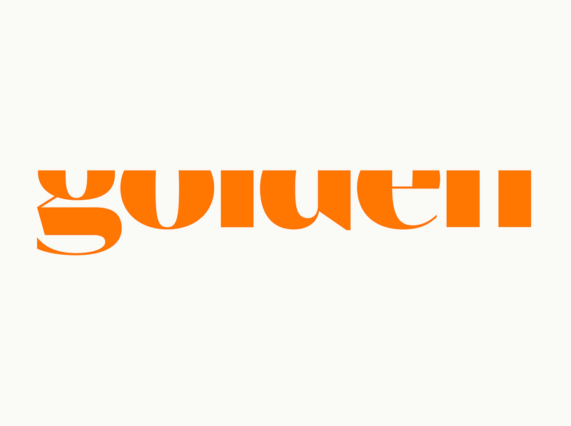
The third mark uses the logo typeset "Golden," cropped to 70% of the x height. This version functions as a teaser for newcomers, and a wink for those in the know.
This is a purely typographic mark, used as a large-format brand texture element — statement apparel, composition anchors, graphic surfaces, and editorial contexts. It reads as both word mark and graphic pattern. The primary color theme for this mark is a Gold mark on an Orange background. This is the only instance in which Orange is used as background.
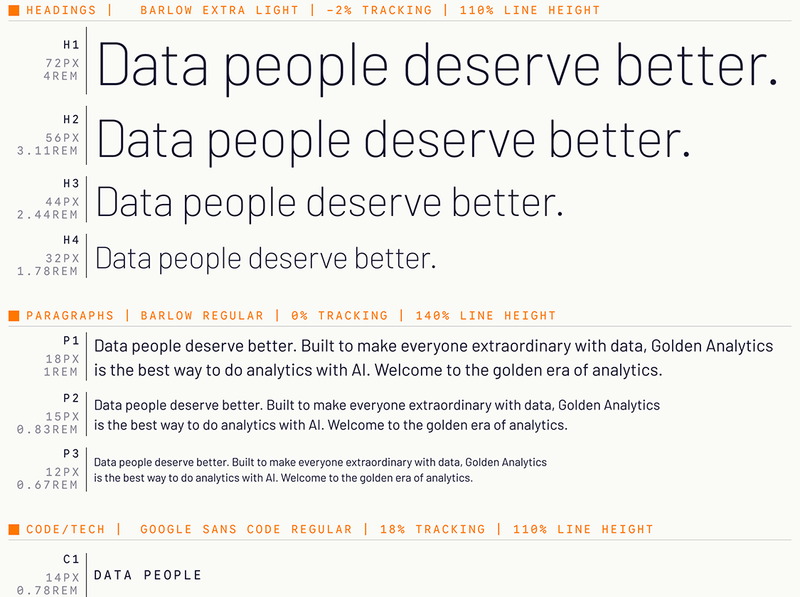
Used across headlines, paragraphs, marketing copy, and display contexts, it’s the workhorse of the system.
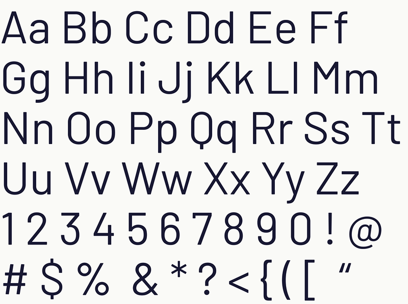
More about Barlow:
Barlow is a slightly rounded, low-contrast, grotesk type family. Drawing from the visual style of the California public, Barlow shares qualities with the state's car plates, highway signs, busses, and trains. Barlow is designed by Jeremy Tribby in San Francisco, USA.
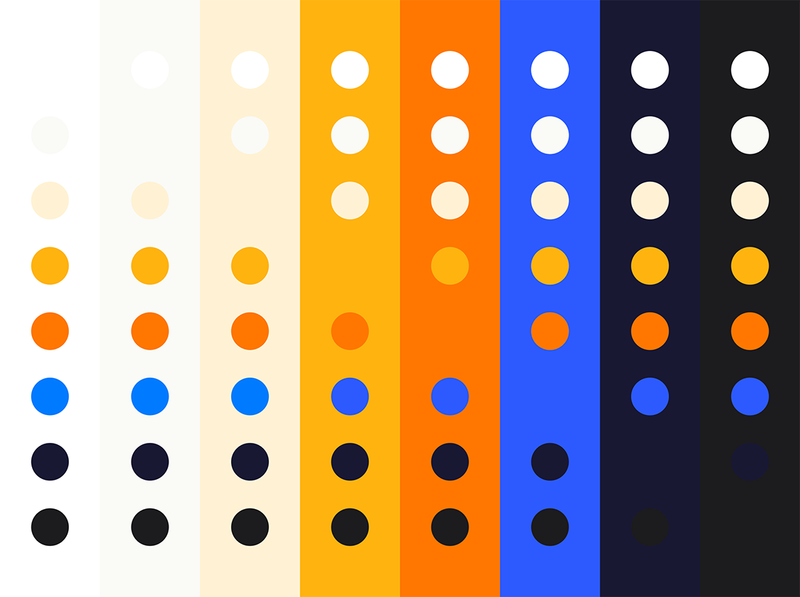
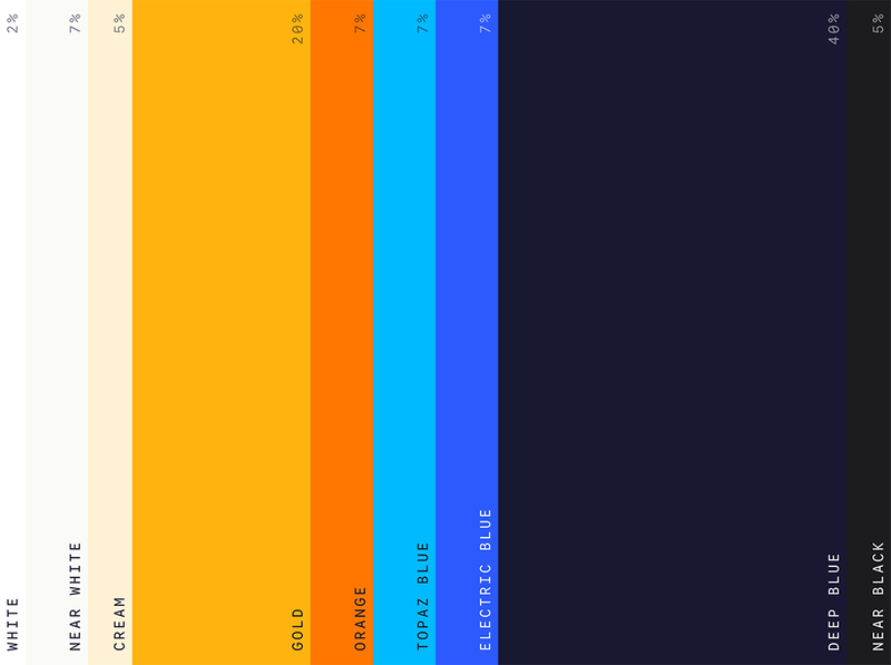
Our digital palette is built for warmth, clarity, and confidence. Gold and orange are energetic without being aggressive; optimistic but not naive. Deep blue grounds the system. Electric Blue brings it all together. These central colors create a tension that feels alive — curious and analytical at once. The neutrals are warm and considered, rarely pure. They give the primary colors room to land. The palette works across the full range of digital contexts: light and dark surfaces, data-dense interfaces, and polished presentation moments.
Only used for text on dark backgrounds when highest level of contrast is required. Never used as a fill or stroke.

Default functional light shade: Used as the background for all light mode surfaces, and content color for all dark mode surfaces. Warm enough to feel considered, neutral enough to support any foreground color.

Rich alternative to near white for luxurious brand moments. Use as a background or headline fill for maximum warmth and impact, never for data-rich, functional moments.
Our signature brand warmth. Used as a background for high contrast sections in a broader environment (both light and dark modes). Used to highlight active states and content. Used for primary graphic elements on orange fields. Used as alternate logo color for rare, specified cases.

High-energy brand accent. Used for unique graphic elements on light and dark backgrounds, including logos, eyebrows (small text elements above headlines), and other anchors. Used sparingly, only for the most important content, never for body copy or all content on a surface.

The high contrast, structural blue. Used for visible grid lines to celebrate the structure of every composition, and for all buttons and actionable elements to provide clear, highly visible direction to the user.

This slightly lighter shade of Electric blue is used for button fills and solid interactive elements on light backgrounds only, to create the same electric feel on those surfaces. Never used for gridlines or secondary button strokes.

The deepest brand color. Used for hero section backgrounds, slide deck foundations, and any surface that demands full brand weight. Used for content on all light backgrounds.

Used instead of pure black for the digital space in all brand-first cases. Used for section backgrounds that should be dark but not deep blue.

Print color is a different discipline than digital and demands its own set of decisions. Where screens emit light, print absorbs it. Our core colors are tuned for ink on paper rather than light on screen. The print palette adds Topaz Blue, an extra vivid shade that brings the same energy of Electric Blue in the digital space. The neutrals narrow to just cream and deep blue, removing the white and near-black that belong to the screen.
Our print palette colors are defined in CMYK and matched to Pantone standards, ensuring consistency across print vendors, paper stocks, and production runs. What you see on screen is a reference, not a guarantee; always proof against the specified PMS values before going to press.
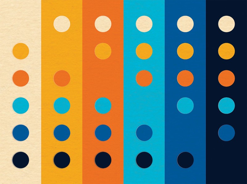
CMYK: 0/3/20/0
Rich alternative to white for luxurious brand moments. Use as a background or headline fill for maximum warmth and impact, never for data-rich, functional moments.
CMYK: 0/33/100/0
Our signature brand warmth. Used as a high contrast background on both dark and light surfaces. Used to activate hero content. Used for primary graphic elements on orange fields. Used as alternate logo color for rare, specified cases.
CMYK: 0/60/100/0
High-energy brand accent. Used for unique graphic elements on light and dark backgrounds, including logos, eyebrows (small text elements above headlines), and other anchors. Used sparingly, only for the most important content, never for body copy or all content on a surface.
CMYK: 75/0/0/0
High contrast, joyful brand presence. Used for actionable elements to provide clear, highly visible focal points.

CMYK: 78/53/0/0
The structural blue. Used for visible grid lines to celebrate the structure of every composition, and for select graphic elements.
CMYK: 90/90/50/60
The deepest brand color. Used for hero backgrounds and any surface that demands full brand weight. Used for content on all light backgrounds.
This represents the color usage hierarchy for all brand surfaces globally. Lead with Deep Blue as the hero surface and Gold as the accent surface. Orange is always present in moderation, and any actionable elements are Electric Blue (digital) or Topaz Blue (print). Incorporate additional brand neautrals to maintain clarity and rhythm.
Our brand photography and video balances precision with warmth across every execution. The visual range runs from expansive, editorial brand moments to clean, information-dense product captures — always with the data as the hero and Golden as the instrument.
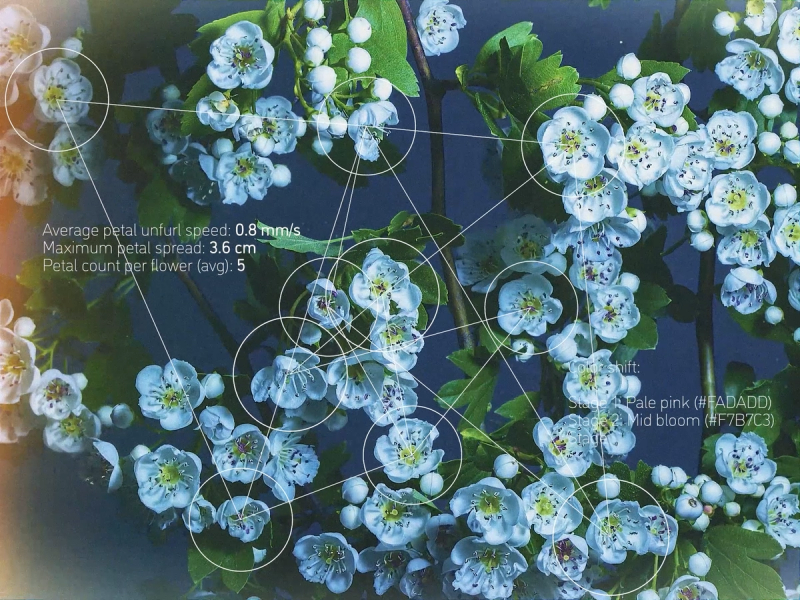
Organic, warm-toned photography forms the brand's textural layer. Preferred subjects: macro botanical detail, geological surface patterns, water and light interactions, and dense geometric forms. The common thread is structured natural order — systems that appear both organic and mathematically precise. These are not decorative choices. They mirror the core idea of Golden: that everything is data, and the right lens reveals it.
Image treatment: warm color grading, high local contrast, restrained saturation. Avoid oversaturated, filter-heavy, or stock-generic nature photography. The images should feel discovered, not styled.
Usage: Full-bleed backgrounds in brand contexts (not product). May be overlaid with data visualization elements to fuse the natural and the analytical. Never used behind product UI.
Scroll on to find these templates:
Read this section for valuable guidelines:
These are good options to display style guide contents. Many of them can change colors, so we need to decide the right rhythm and what each color section indicates. If photos are possible in the layout, they are shown as the orange wordmark. In most cases, these layouts are also available without images.
Lorem ipsum dolor sit amet consectetur adipiscing elit. Quisque faucibus ex sapien vitae pellentesque sem placerat. In id cursus mi pretium tellus duis convallis. Tempus leo eu aenean sed diam urna tempor. Pulvinar vivamus fringilla lacus nec metus bibendum egestas. Iaculis massa nisl malesuada lacinia integer nunc posuere. Ut hendrerit semper vel class aptent taciti sociosqu. Ad litora torquent per conubia nostra inceptos himenaeos.
Lorem ipsum dolor sit amet consectetur adipiscing elit. Quisque faucibus ex sapien vitae pellentesque sem placerat. In id cursus mi pretium tellus duis convallis. Tempus leo eu aenean sed diam urna tempor. Pulvinar vivamus fringilla lacus nec metus bibendum egestas. Iaculis massa nisl malesuada lacinia integer nunc posuere. Ut hendrerit semper vel class aptent taciti sociosqu. Ad litora torquent per conubia nostra inceptos himenaeos.
This is great for directing visitors to external resources and asset downloads.

Here is a rich text Section to be styled however you want!
Body copy is normal like this. Write paragraphs in this. Lorem ipsum dolor sit amet consectetur adipiscing elit. Quisque faucibus ex sapien vitae pellentesque sem placerat. In id cursus mi pretium tellus duis convallis. Tempus leo eu aenean sed diam urna tempor. Pulvinar vivamus fringilla lacus nec metus bibendum egestas. Iaculis massa nisl malesuada lacinia integer nunc posuere.
"Quotes are styled like this."
Text links look like this. File links are the same.
Bullet lists look like this:
Inline Images look like this:

Here are the details of the step. Let's keep it short and sweet.
Here are the details of the step. Let's keep it short and sweet.
Here are the details of the step. Let's keep it short and sweet.
This is the story content. Lorem ipsum dolor sit amet consectetur adipiscing elit. Quisque faucibus ex sapien vitae pellentesque sem placerat. In id cursus mi pretium tellus duis convallis.
This is the story content. Lorem ipsum dolor sit amet consectetur adipiscing elit. Quisque faucibus ex sapien vitae pellentesque sem placerat. In id cursus mi pretium tellus duis convallis.
This is the story content. Lorem ipsum dolor sit amet consectetur adipiscing elit. Quisque faucibus ex sapien vitae pellentesque sem placerat. In id cursus mi pretium tellus duis convallis.
This is the story content. Lorem ipsum dolor sit amet consectetur adipiscing elit. Quisque faucibus ex sapien vitae pellentesque sem placerat. In id cursus mi pretium tellus duis convallis.
Here's my answer. Try to keep to just a few lines, as more than that is overwhelming.
Here's my answer. Try to keep to just a few lines, as more than that is overwhelming.
Here's my answer. Try to keep to just a few lines, as more than that is overwhelming.