41 ways to look at your data
Golden's chart builder has 40+ chart types, about 55 looks once you add the modifiers, and a set of dashboard cards to go with them. Here's the whole toolbox, every chart built in Golden.
We counted. Golden's chart builder has 41 chart types. Stack the modifiers on top (quadrants, forecasts, funnel styles, five radial shapes) and you get roughly 55 distinct looks. Then there are the dashboard cards that sit next to them.
In traditional BI tools, most of these charts are possible. Getting there is another story. A Sankey usually means a workaround from an old forum thread. A radial chart means a few blog posts and a stack of calculated fields. Some charts need a third-party extension before you can even start. And nearly all of them assume someone on the team is the expert who's done it before.
Golden takes that work off your plate. Drag fields onto shelves, pick a chart, and Golden handles the fiddly parts automatically. It puts funnel stages in order, picks the histogram bins, and reshapes survey data so it can diverge. Every chart below was built that way.
That's a lot to keep in your head. So here's the whole toolbox, every chart built in Golden by dragging fields onto shelves.
Most of them use the Golden Records sample that ships with every account: 10,000 orders of vinyl, CDs, box sets and streams across 8 genres. A few charts need a different shape of data, so the survey charts use a 100-person employee survey, the range charts use product ratings, the funnels use a 10,000-deal sales pipeline, and the Gantt uses a real project plan.
Bars do the heavy lifting
Most business questions are "which one is bigger?" Bars answer that faster than anything else.
Bar chart
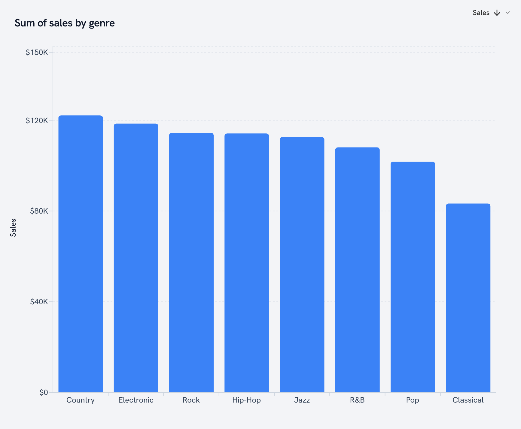
The default for a reason. Sales by genre, done.
Horizontal bar
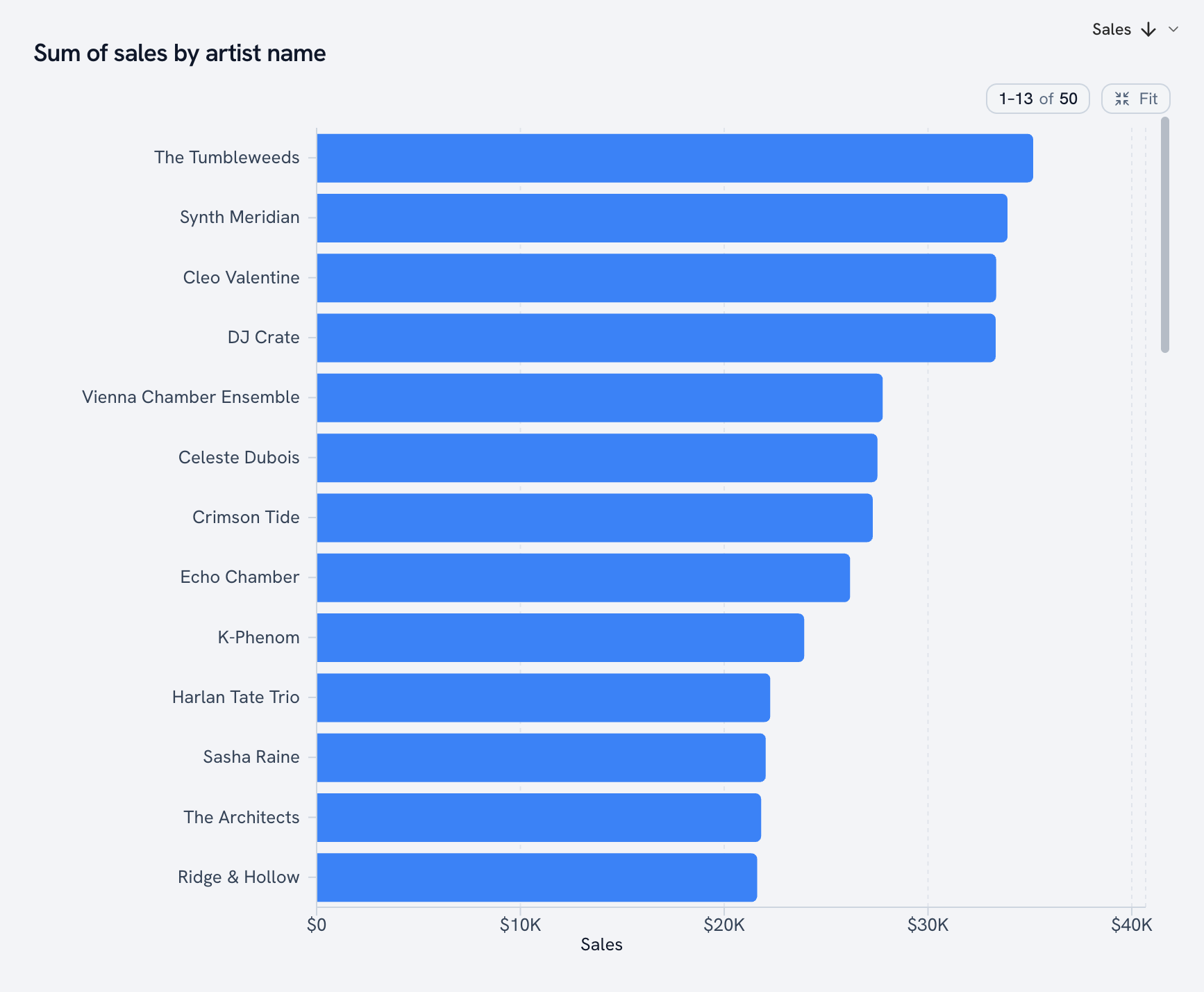
Same idea, turned sideways. Use it when the labels are long, like 50 artist names.
Stacked bar
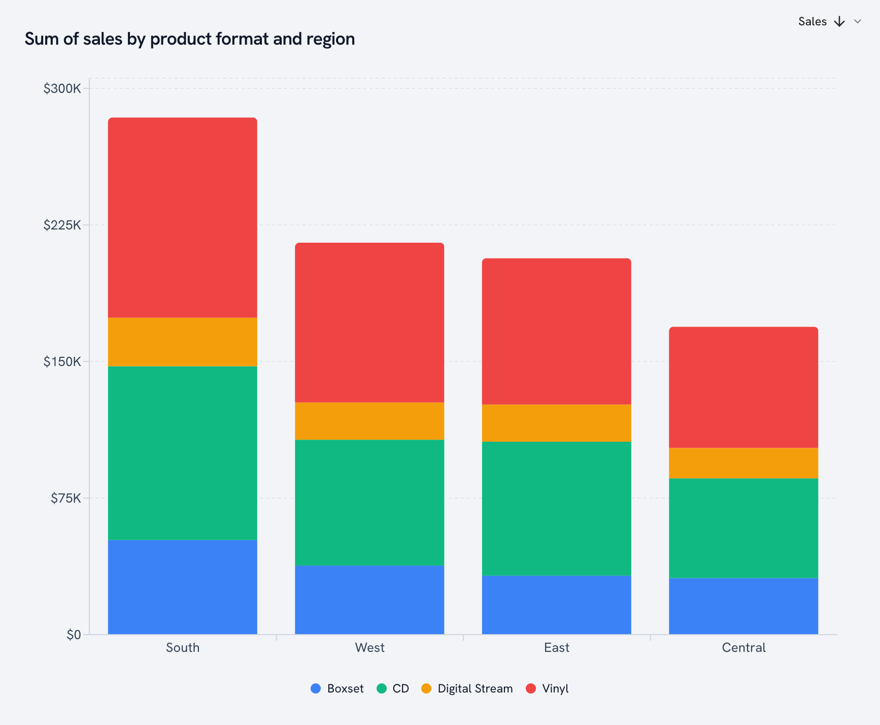
Drop a field on Color and every bar splits into its parts. Each region, broken down by format.
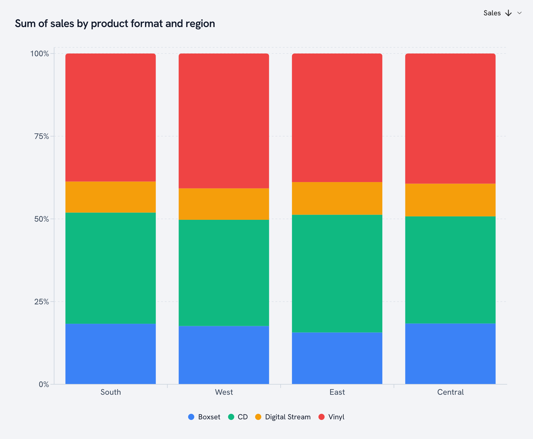
100% stacked bar
Same stack, every bar stretched to 100%. Totals drop out and the mix comes forward.
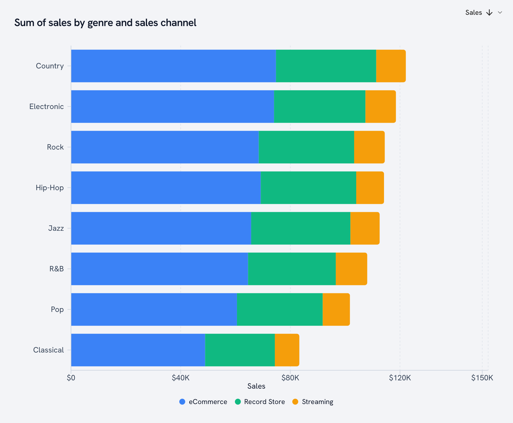
Horizontal stacked bar
The stacked bar, sideways. Genre by sales channel.
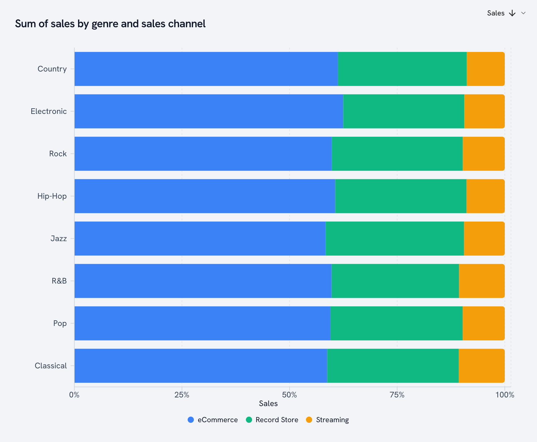
100% horizontal stacked bar
One of the cleanest ways to compare shares across groups. Does Jazz sell through a different channel than Hip-Hop? Now you know.
Diverging bar
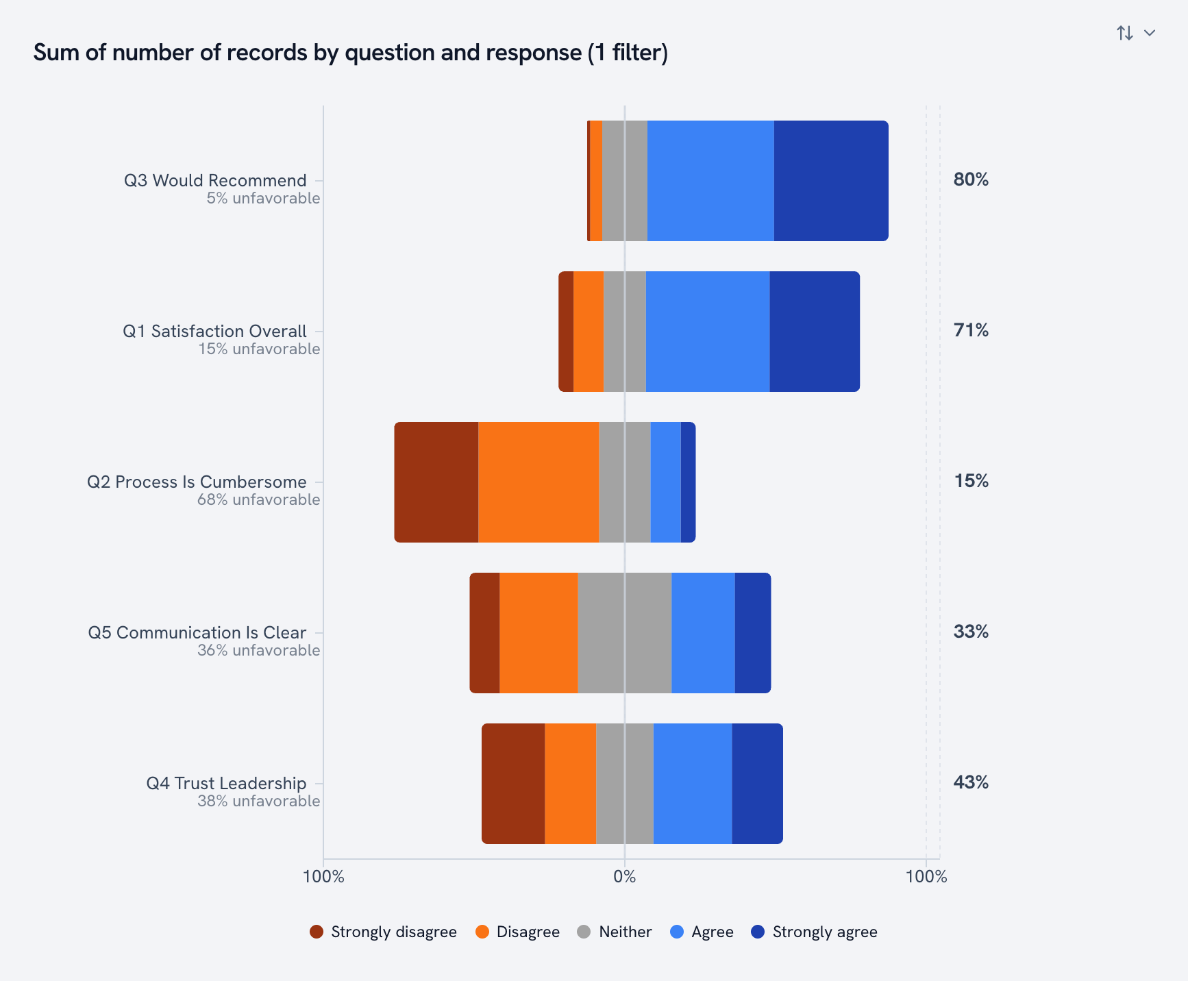
Built for survey scales. Disagree on the left, agree on the right, neutral straddling the middle, and the percent favorable on the end of every row. Golden spots Likert columns when you upload and offers to reshape them for you.
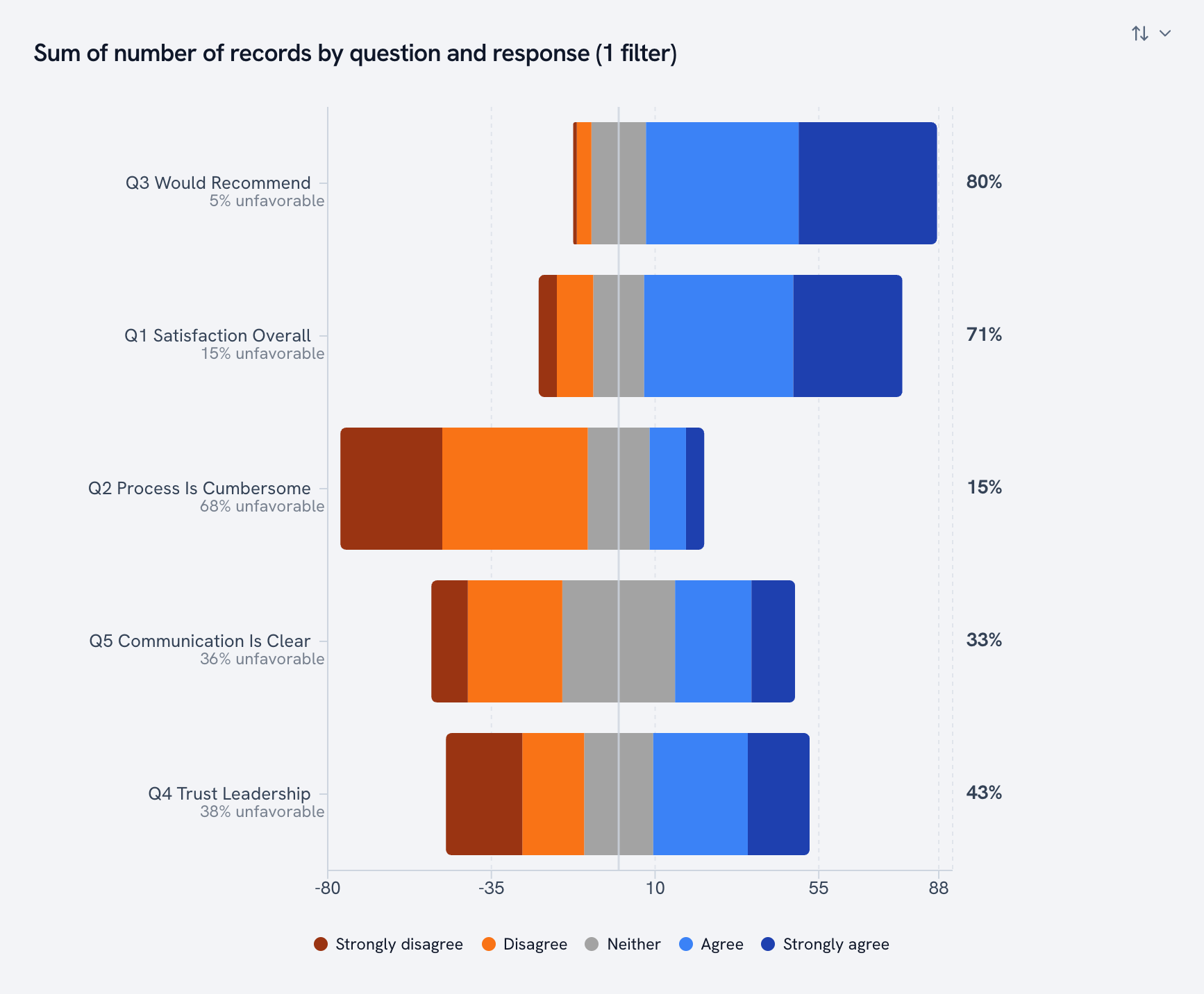
Flip on "share of row" and every question gets the same width, so a question 40 people answered compares fairly with one 100 people answered.
Comparison
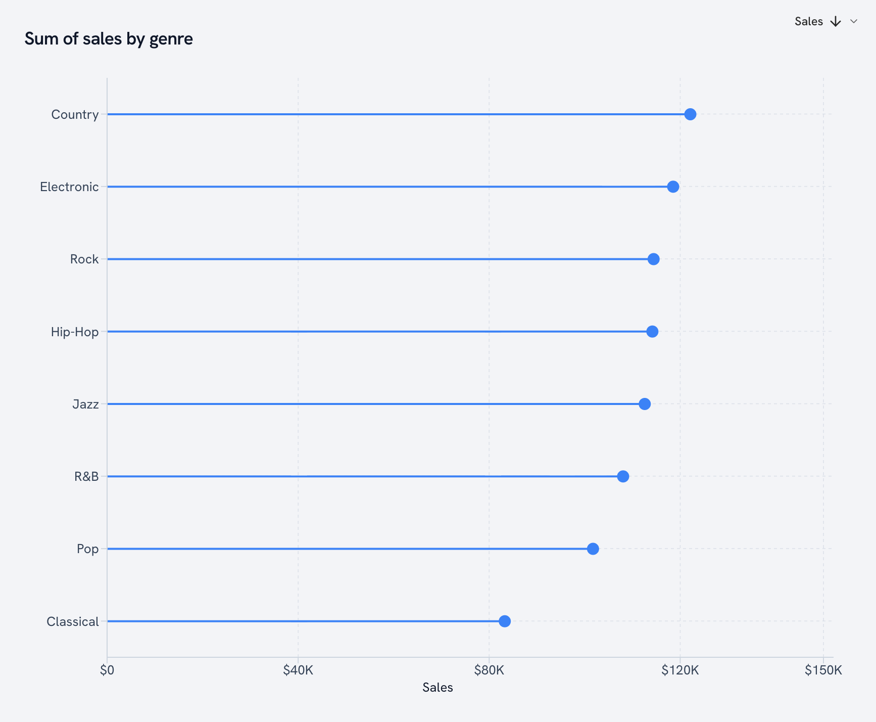
Lollipop
A bar chart on a diet. Same information, less ink.
Range bar
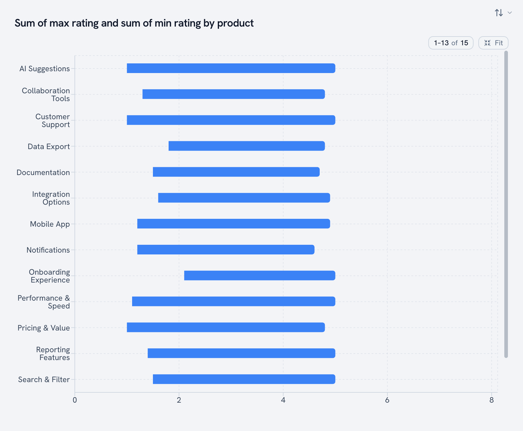
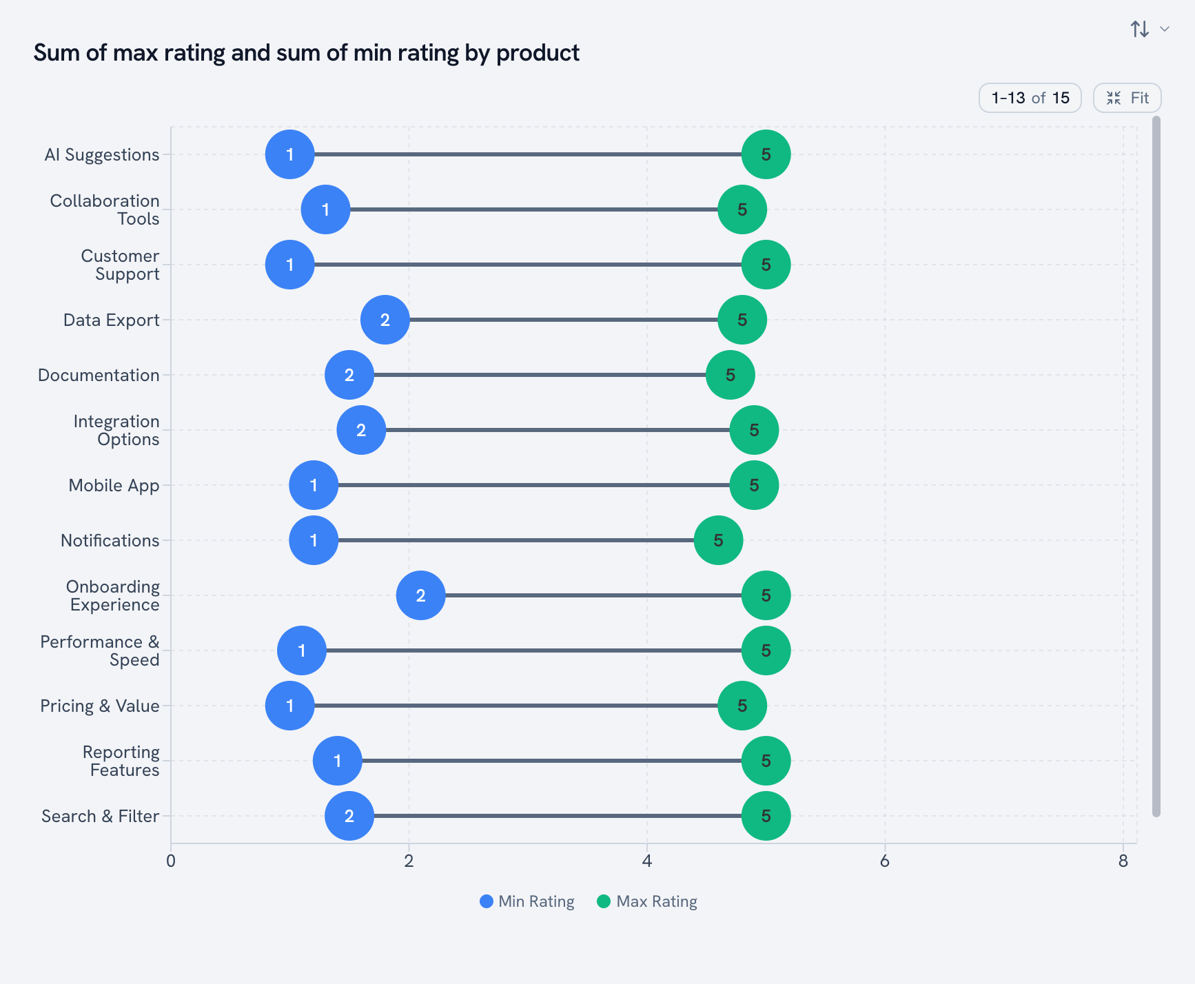
Two values per row, drawn as the span between them. Here, the lowest and highest rating each product got.
Prefer dots? The dumbbell style draws the same span with a marker on each end.
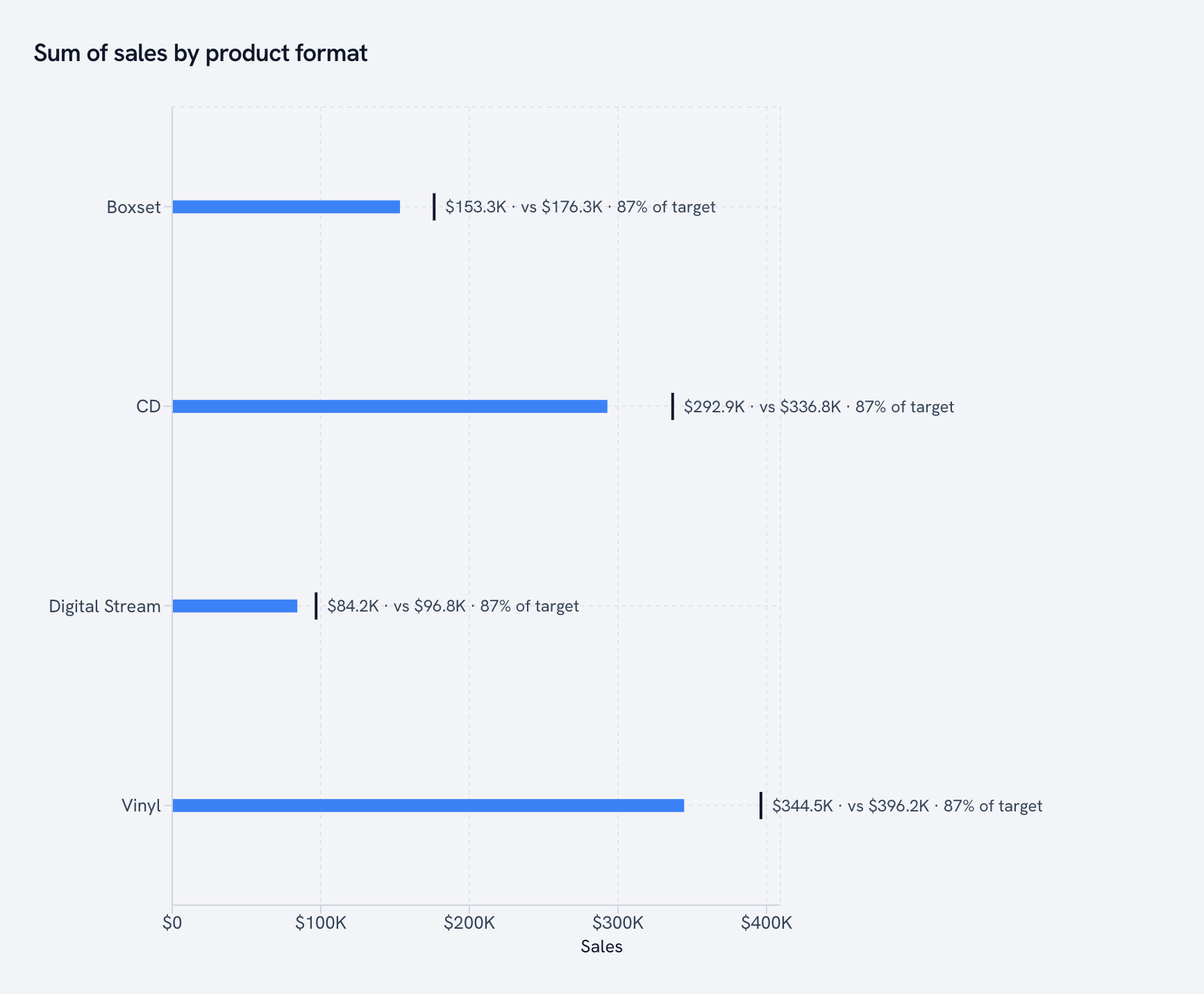
Bullet chart
Actual vs. target in one compact bar. The tick is the goal, the bar is reality.
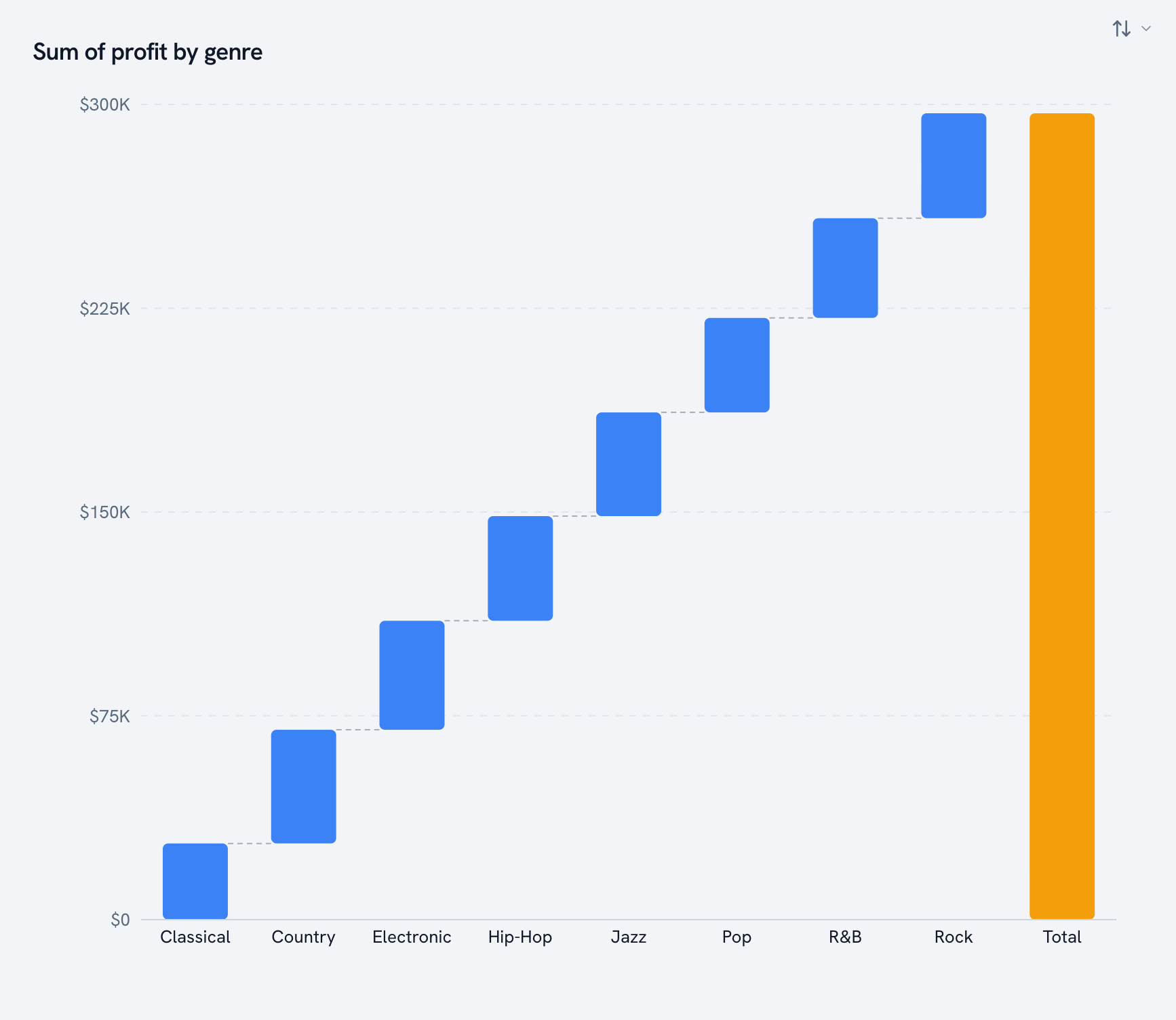
Waterfall
How you get from zero to the total, one step at a time. Each genre's profit stacks on the last, and the gold bar is where you land.
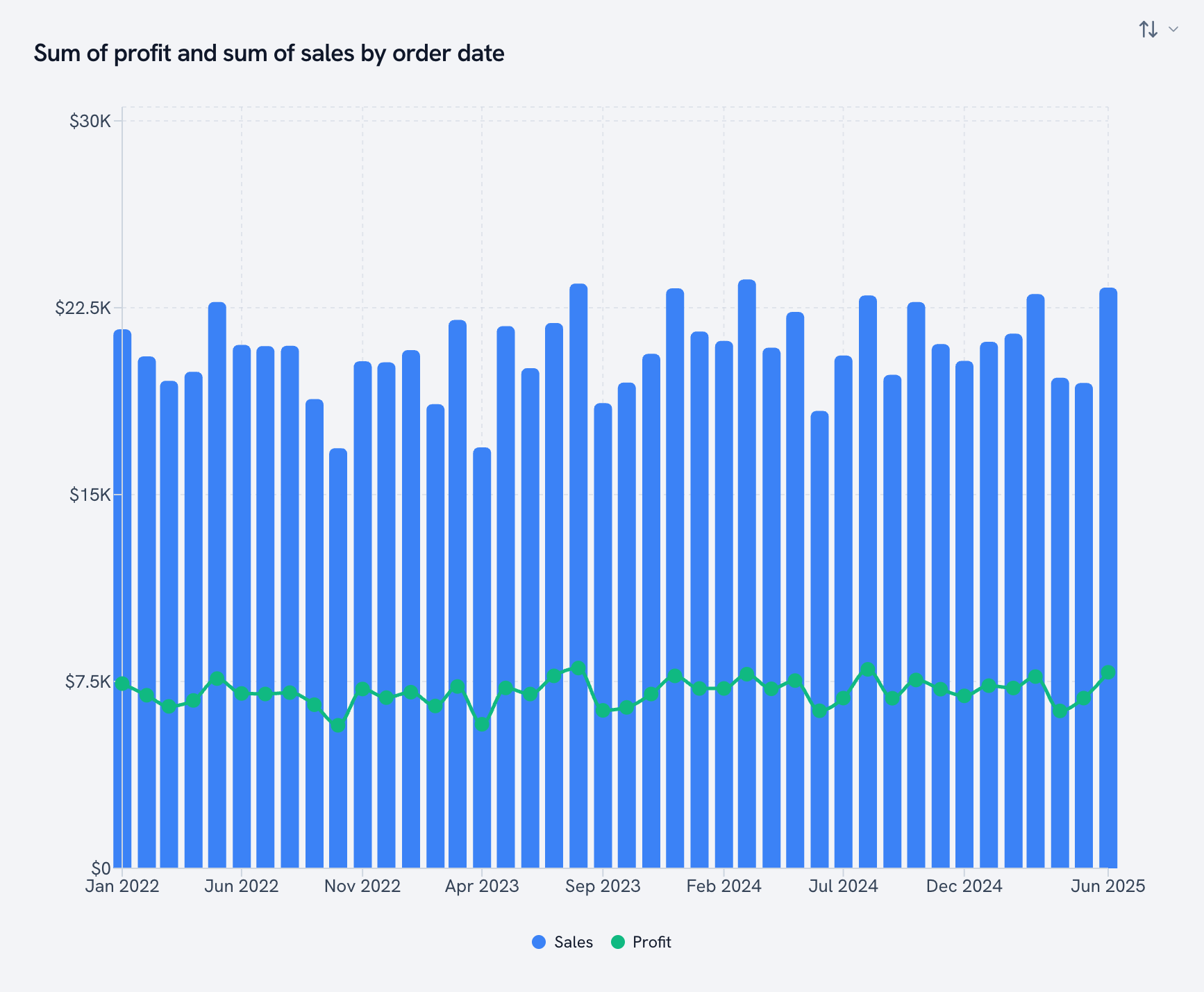
Combination
Bars and a line on one canvas. Sales as bars, profit as a line, same months.
Lines are for time
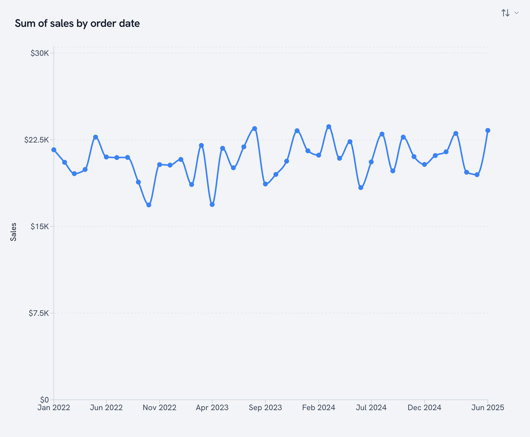
Line chart
Monthly sales, four years of them.
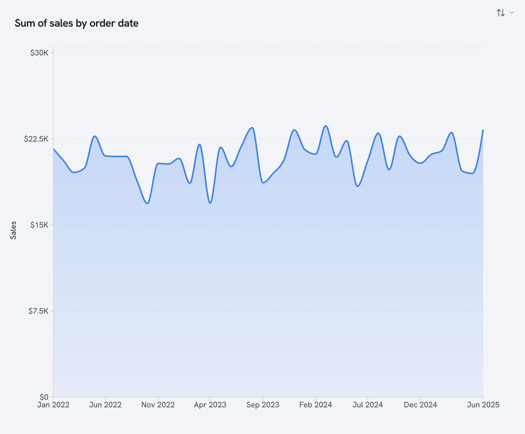
Area chart
A line with the space underneath filled in. Good when volume matters as much as direction.
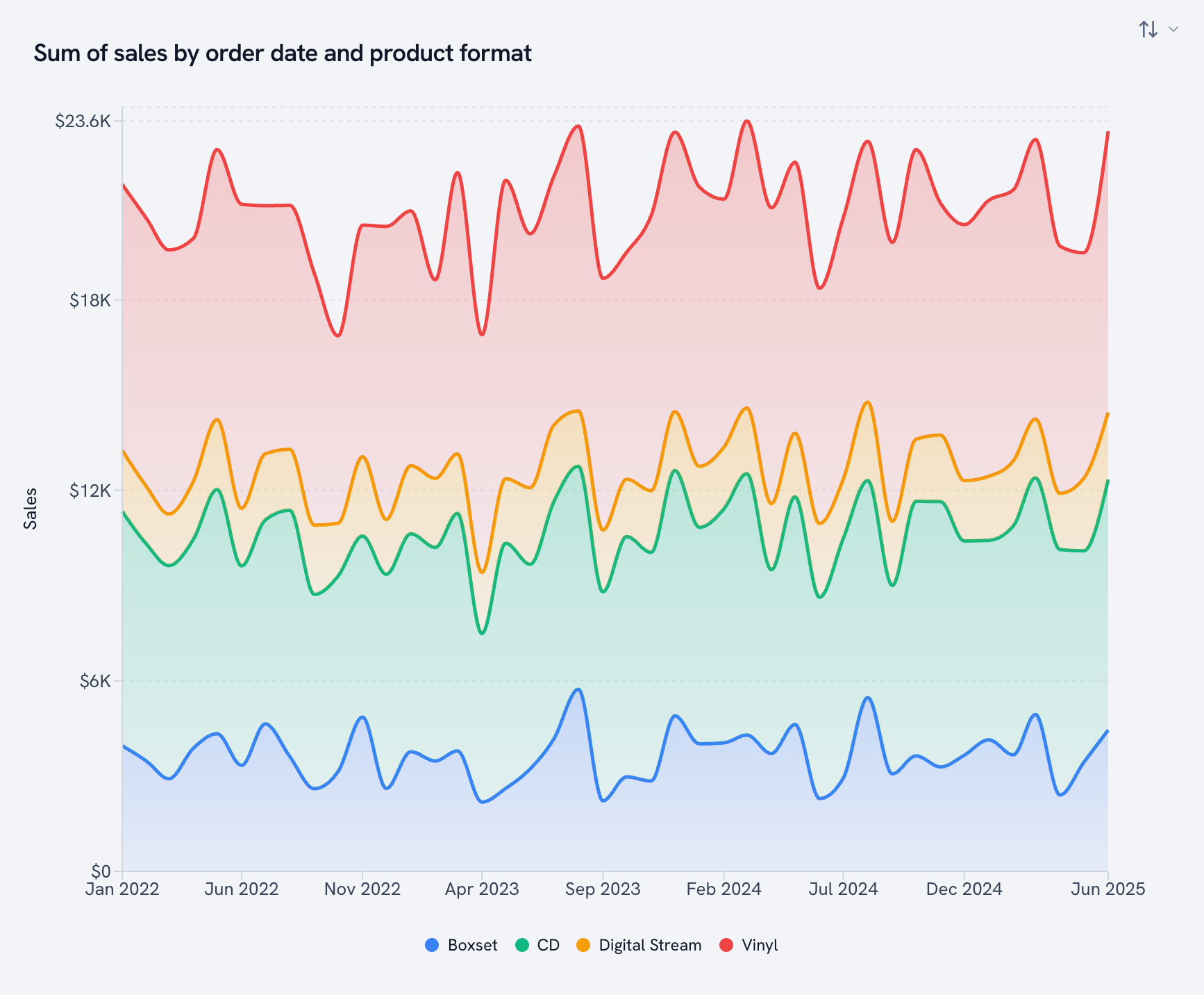
Stacked area
Each format stacked on the one below, so you see the total and the parts at once.
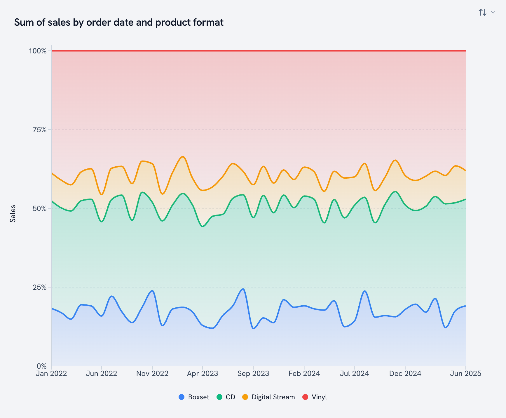
100% stacked area
The mix over time. Is vinyl growing its share, or just riding the tide?
Parts of a whole
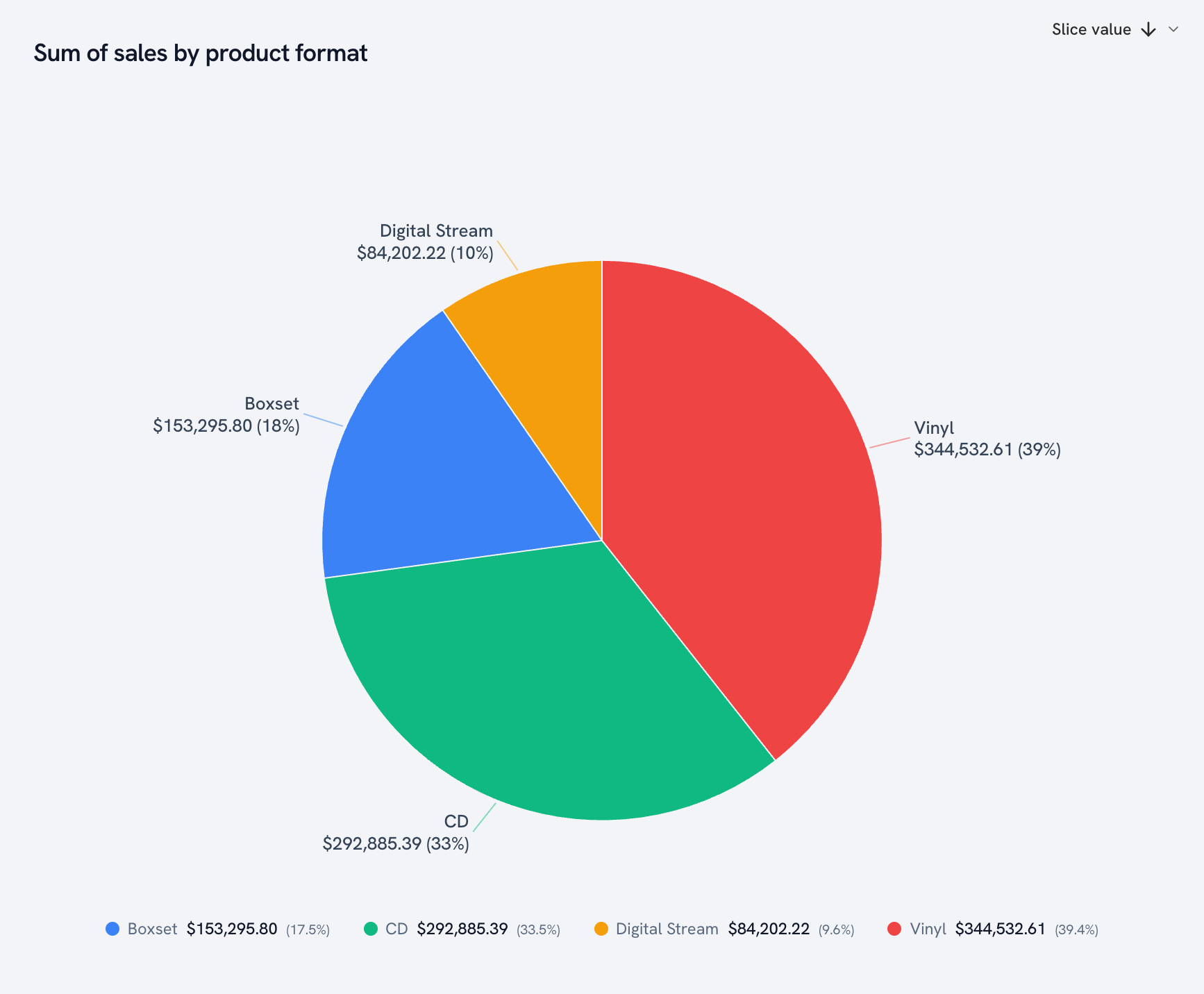
Pie chart
Yes, we have pie charts. Keep them to a handful of slices and they're great. Four formats is perfect.
Donut chart
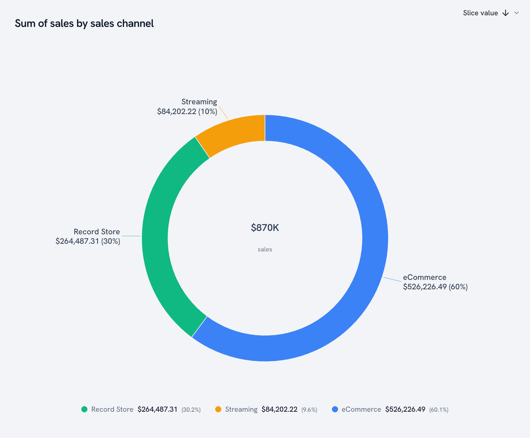
A pie with a hole in the middle, and we put the total in the hole. (It's one toggle away from the pie.)
Treemap
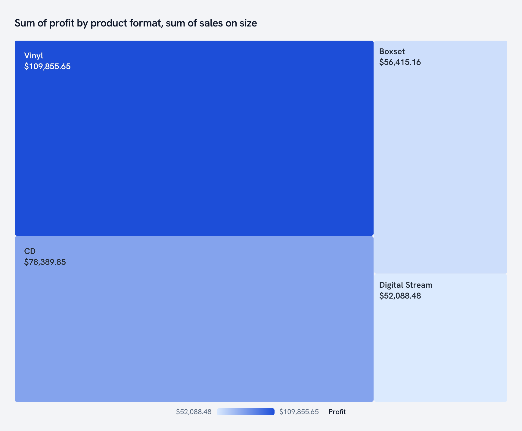
Every format as a rectangle sized by sales and shaded by profit. Vinyl takes the biggest bite of the catalog, and the color shows which formats actually make money.
Flow and process
Sankey diagram
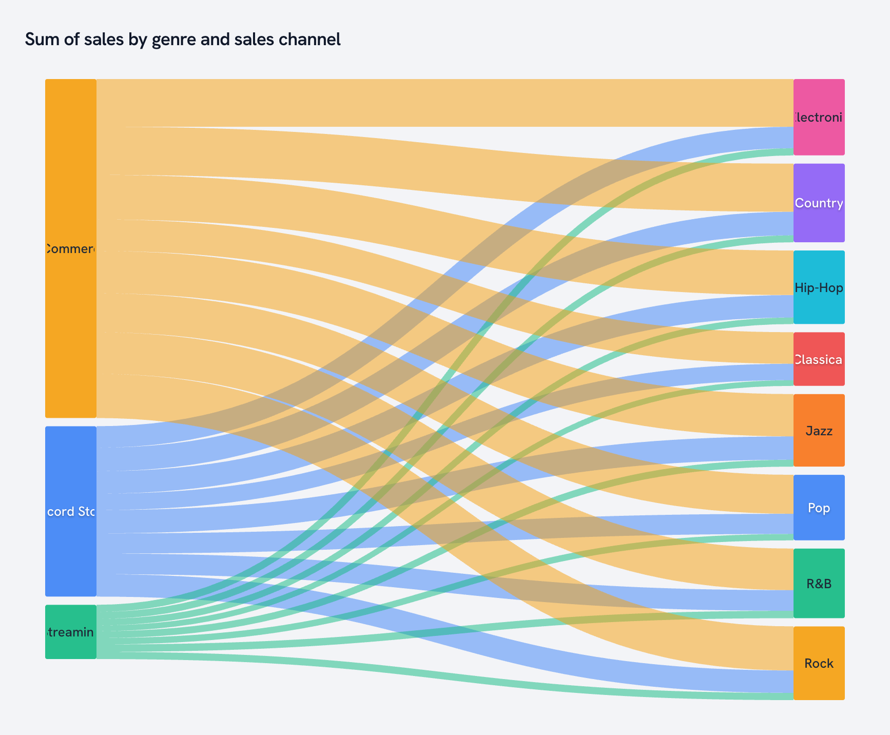
Follow the money. Each sales channel flows into the genres it sells.
Funnel
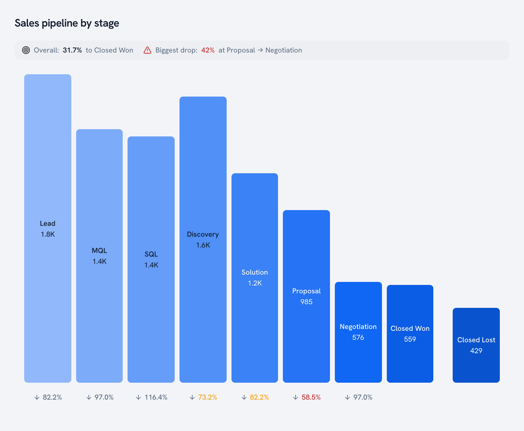
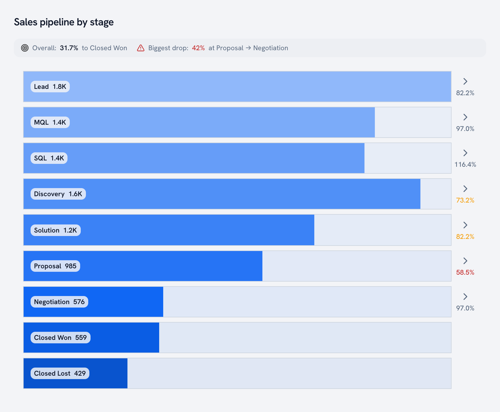
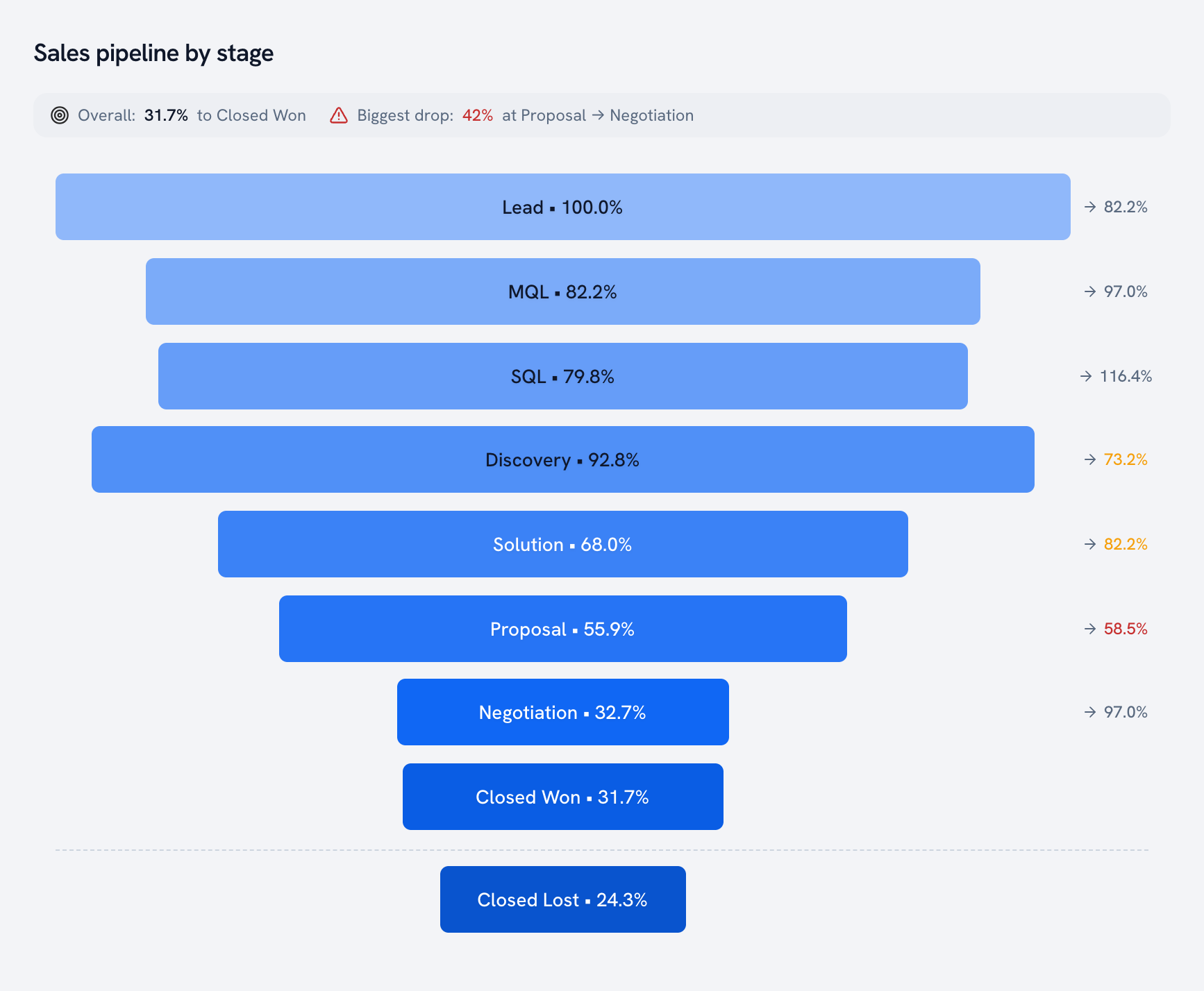
A 10,000-deal sales pipeline, Lead through Closed Won. Golden puts the stages in pipeline order, sets Closed Lost apart as an outcome rather than a step, and calls out the overall win rate and the biggest leak at the top.
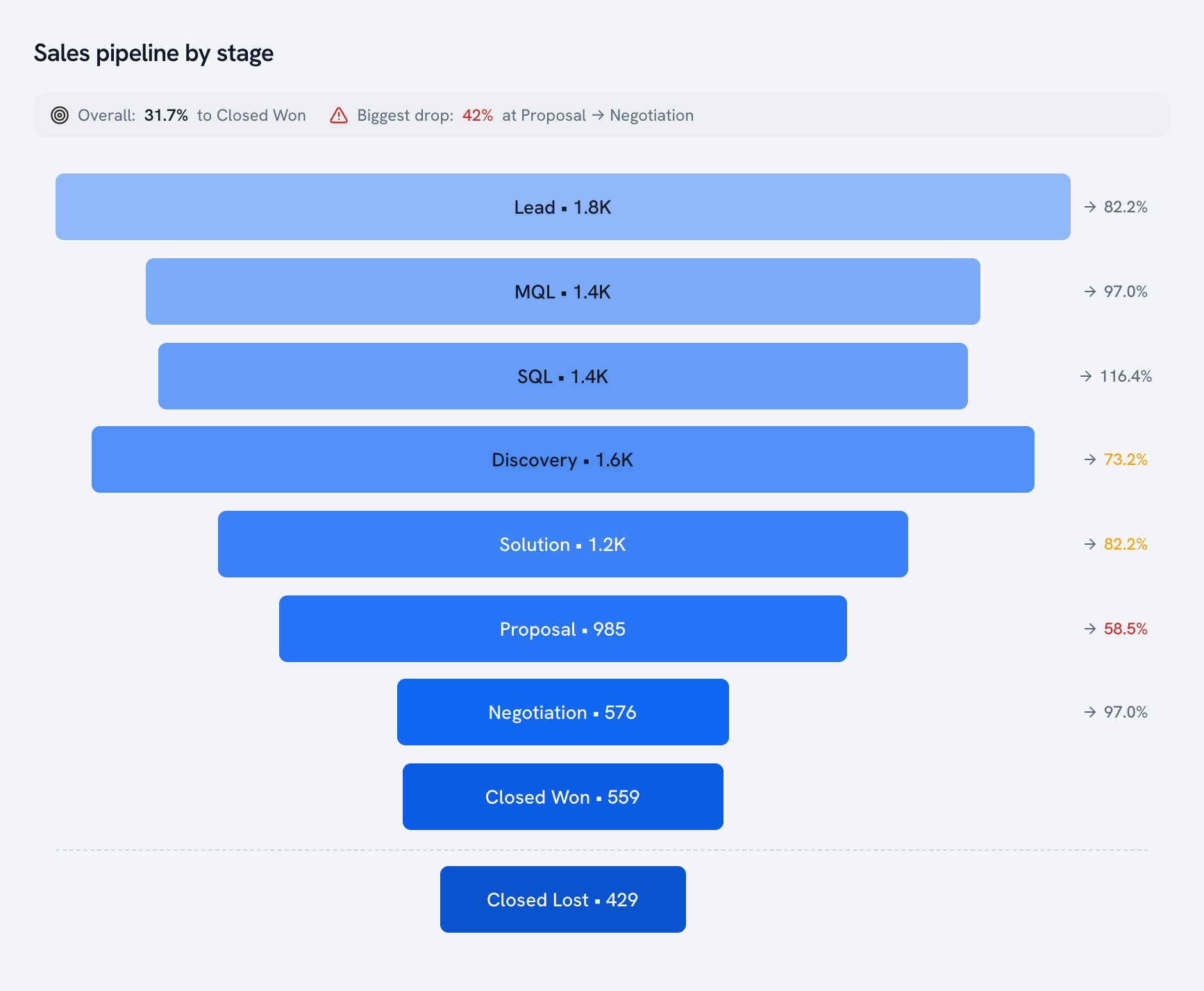
Funnels come in a few styles. Vertical:
Step bars, where every stage spans the full width and the fill shows what's left:
And labeled as a percentage of the first stage, so the question becomes "how much of what we started with is still here?"
Gantt chart
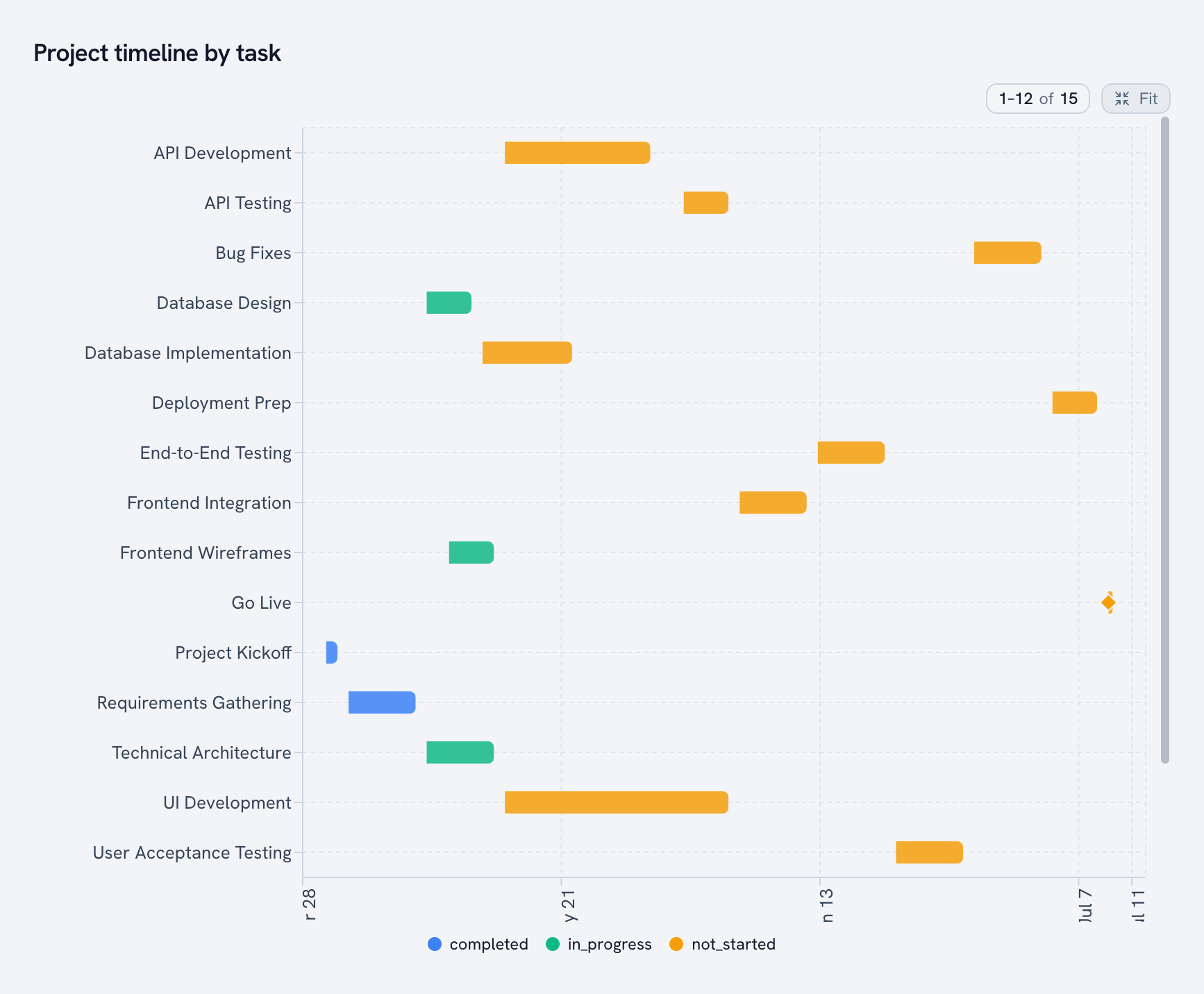
Start, end, and who's late. A 15-task launch plan, colored by status, with Go Live as a milestone diamond. Long plans scroll, so the rows stay readable.
Driver tree
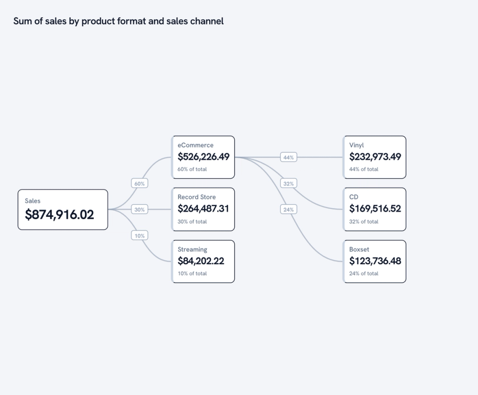
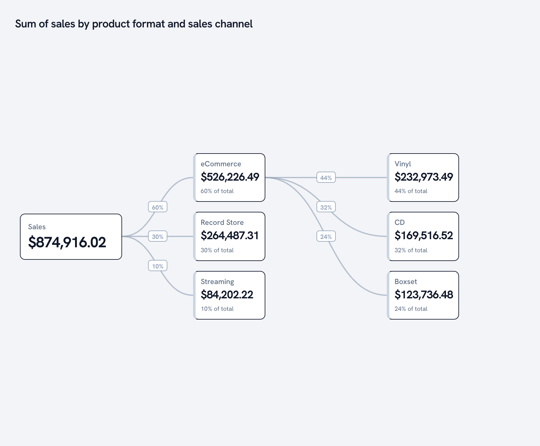
Break a total into what drives it. Sales splits by channel, then by format, with each branch's share of its parent.
Relationships and distributions
Scatter plot
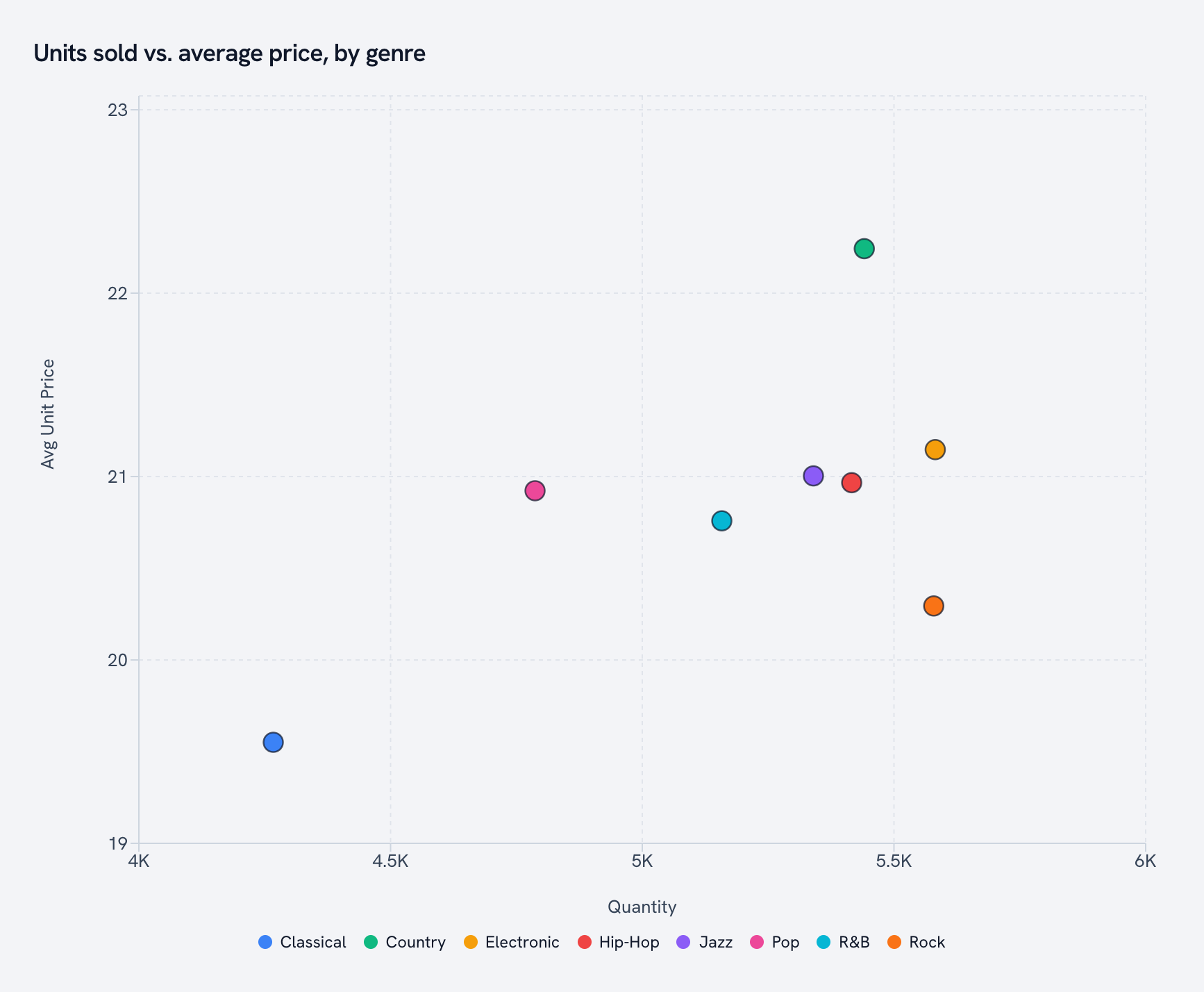
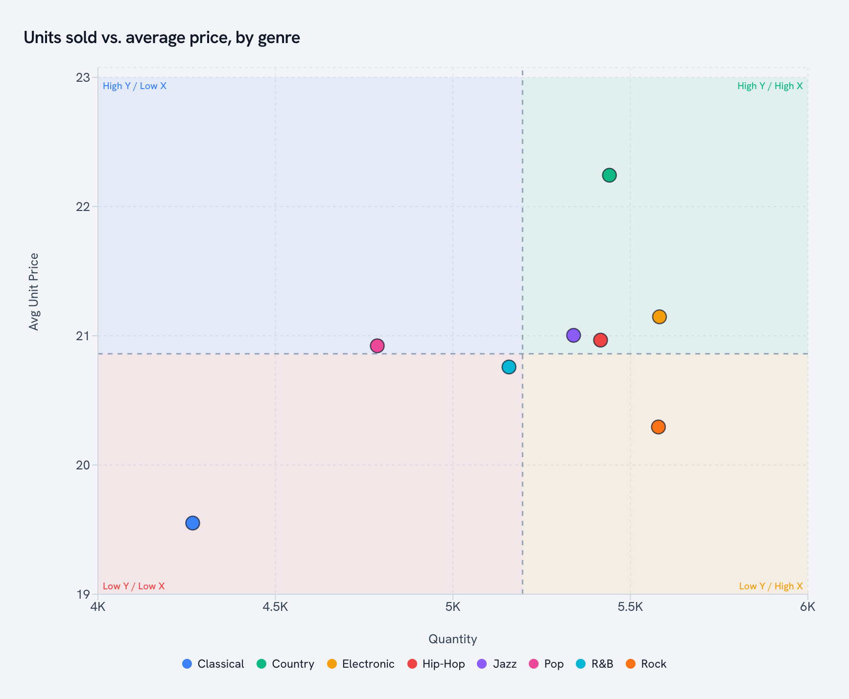
Units sold on X, average price on Y, one dot per genre. Classical sells fewer records at a lower price. Everyone else clusters up and to the right.
Histogram
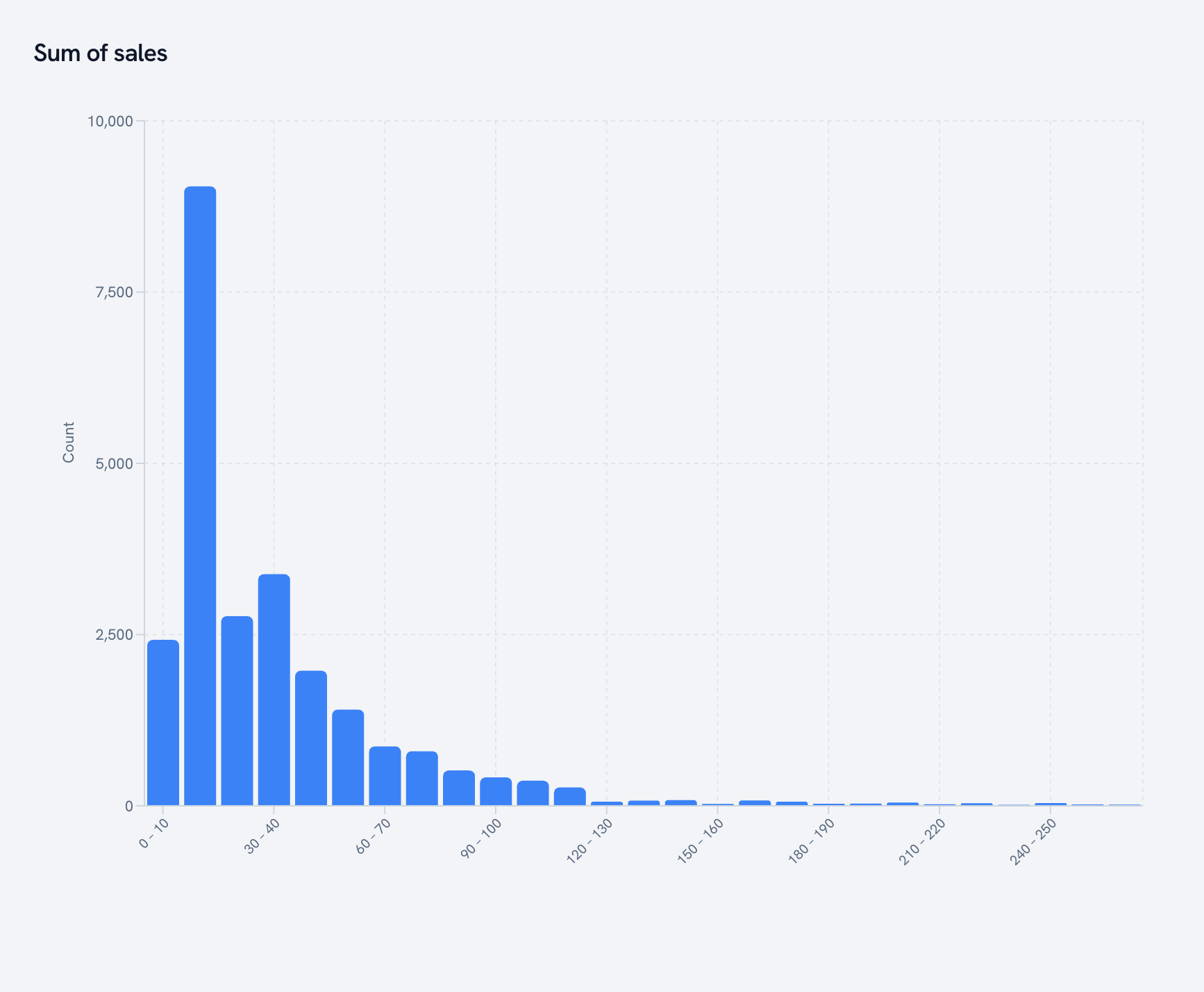
How order values are actually distributed. Golden picks the bins and folds extreme outliers into edge bars so the shape stays readable.
Box plot
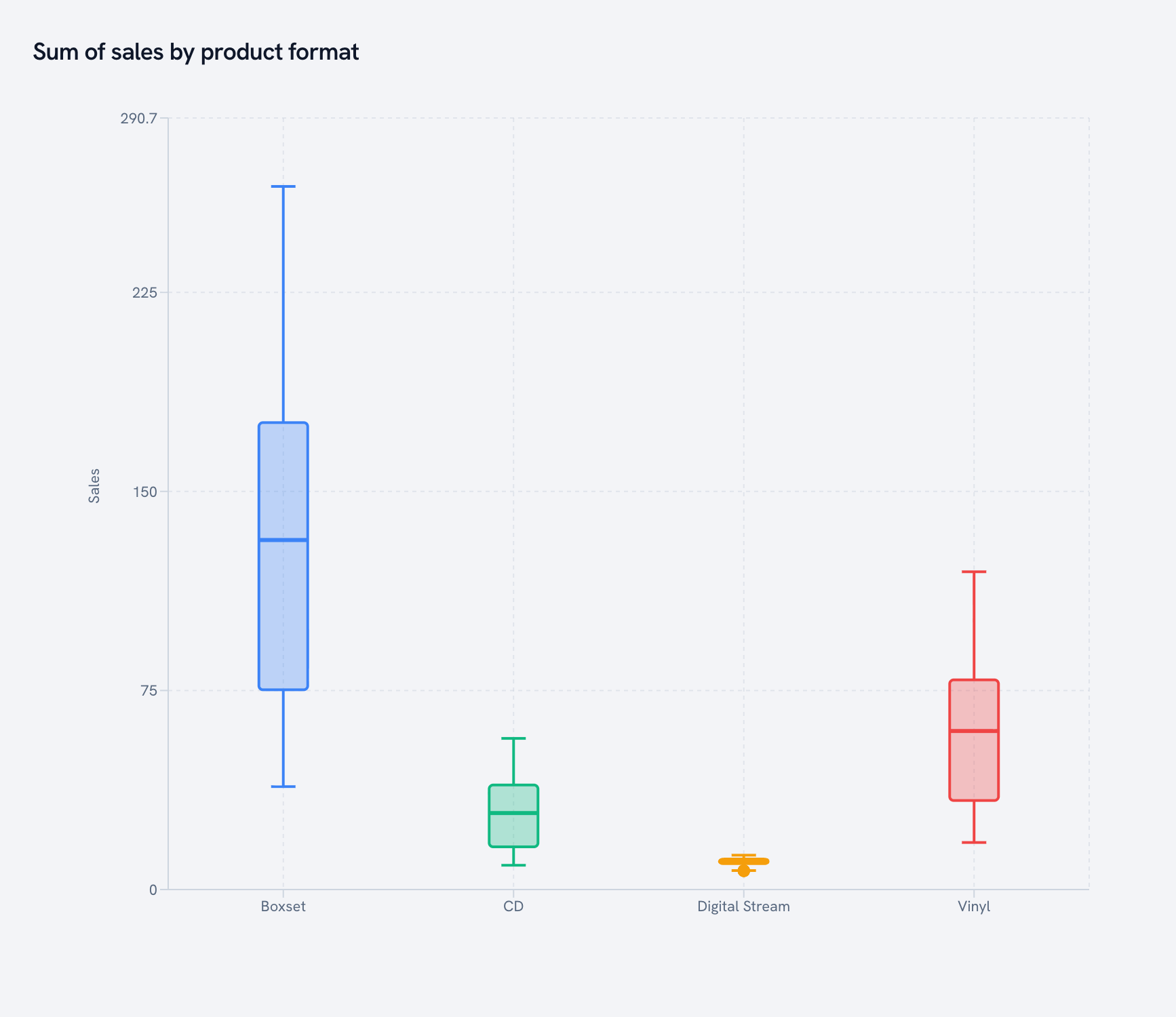
Median, quartiles and whiskers for every format. Box sets are a different business than streams, and this chart says so in one glance.
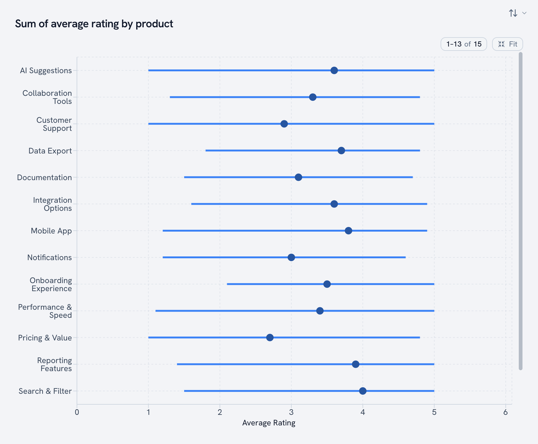
Interval plot
An estimate with its low and high bounds. Every product's average rating, with the full range customers gave it.
Grids
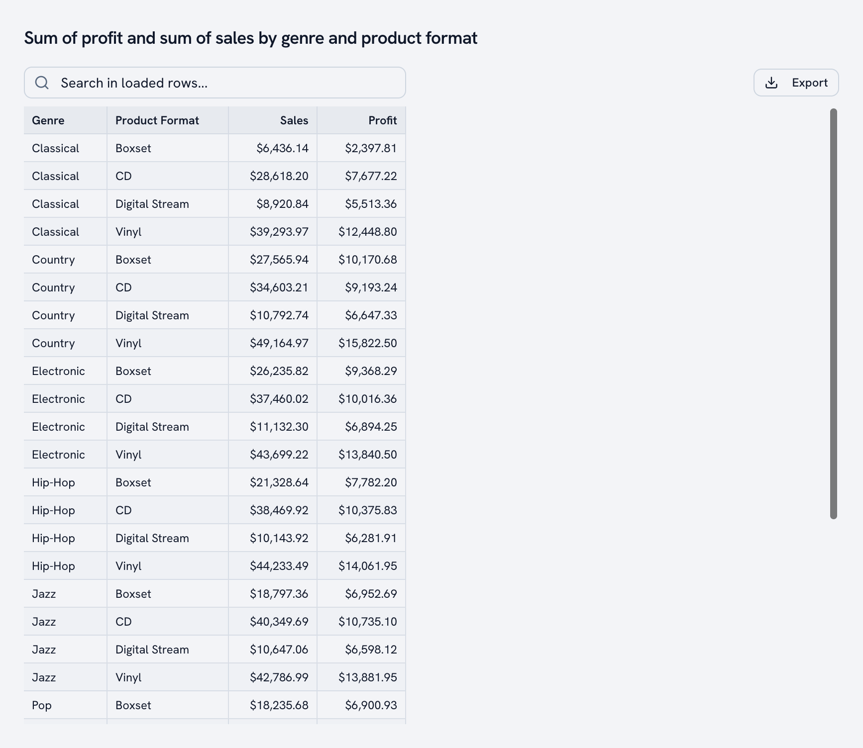
Table
Sometimes you just need the rows. Searchable, sortable, exportable.
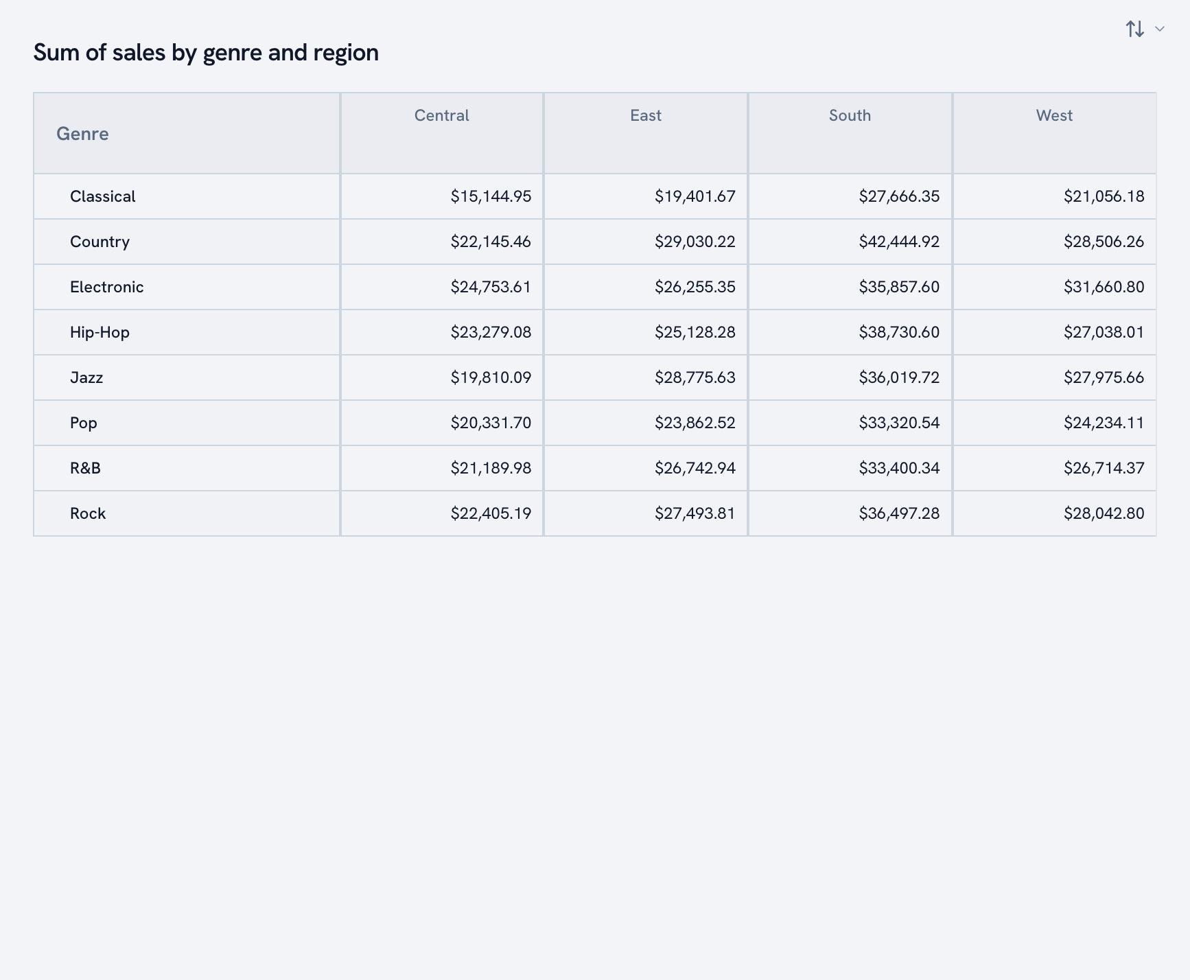
Pivot table
Rows, columns, values. Genre by region in about four seconds.
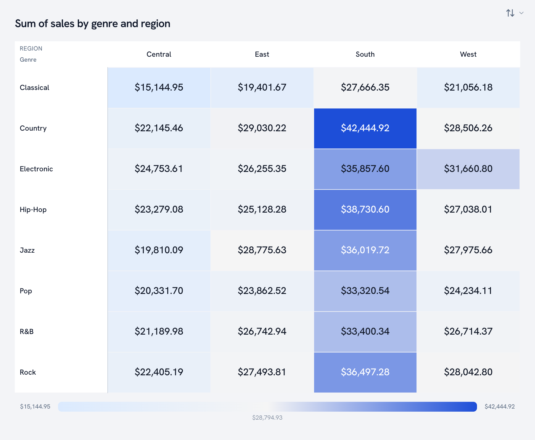
Heatmap
A pivot table that went to art school. Color does the scanning for you. (You'll also see "matrix heatmap" in the code; it's the same grid.)
Maps
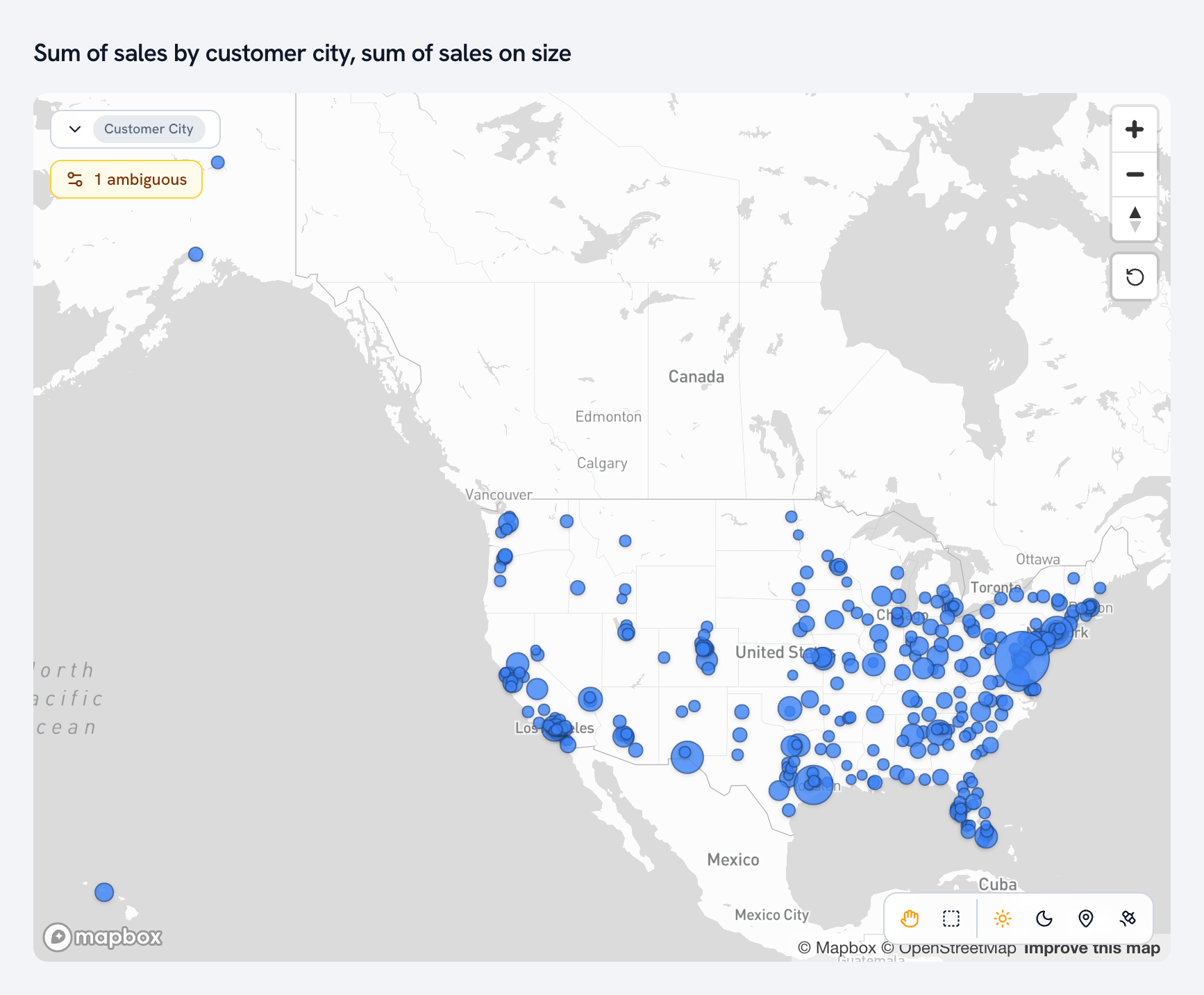
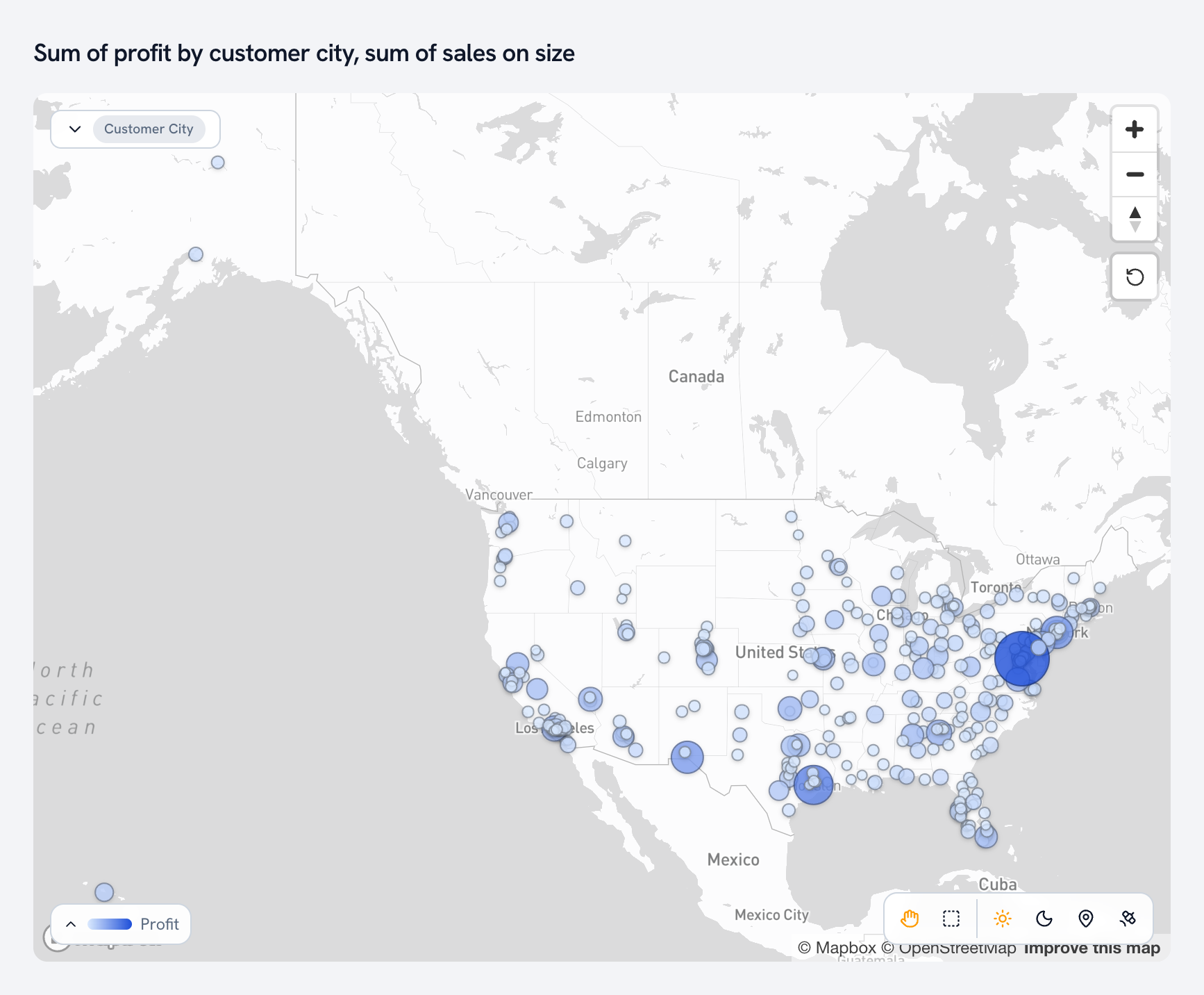
Map and shape map
Points on a map, sized and colored by your measures. Every customer city, sized by sales.
Filled map
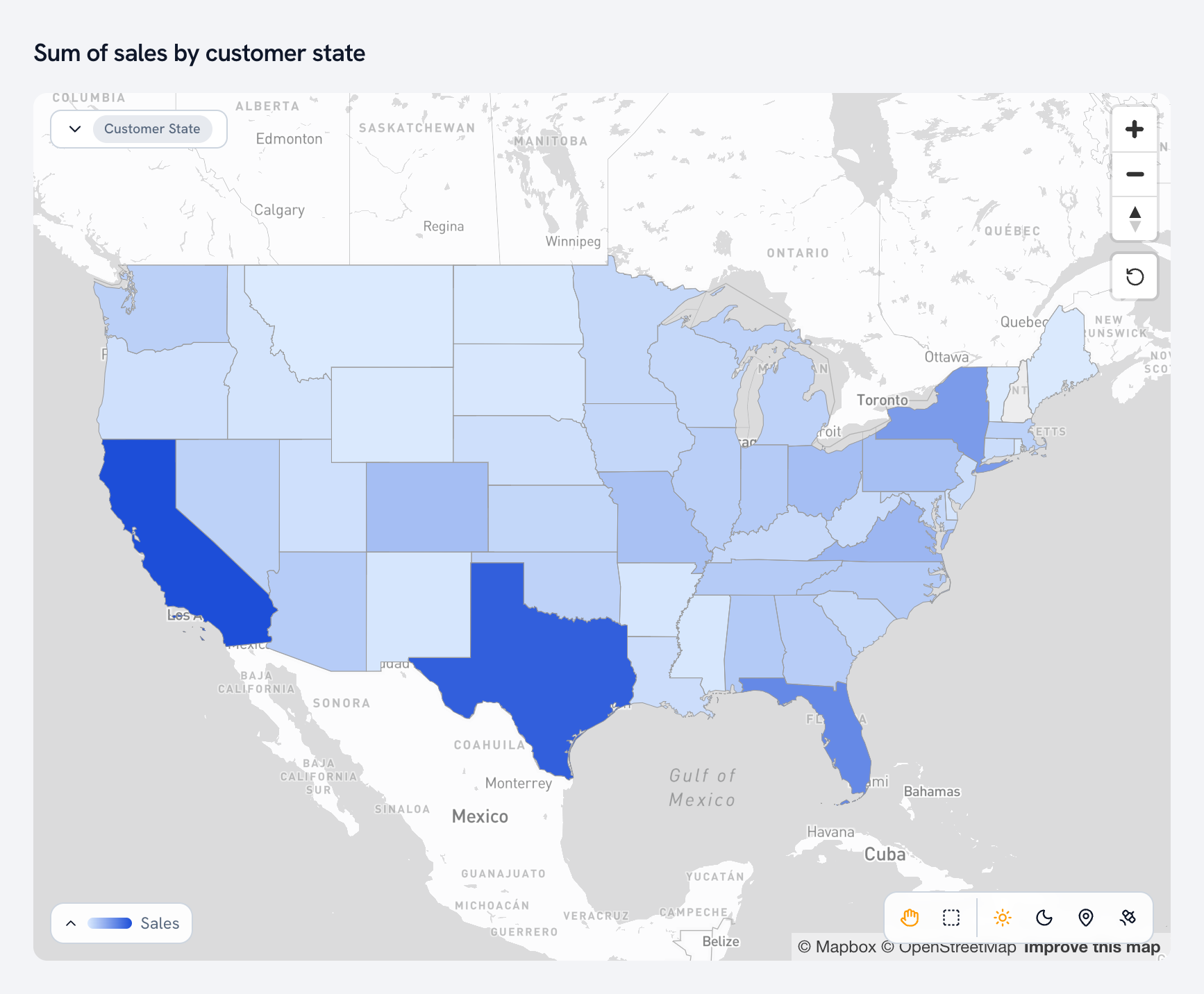
States shaded by value. (Older dashboards call this a choropleth, and it's the same map.)
Density map
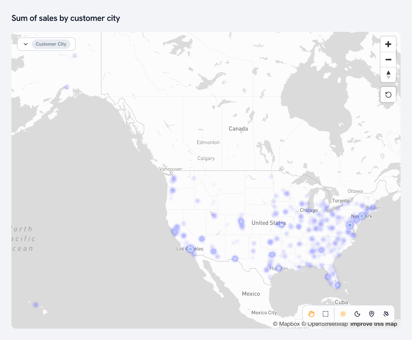
Where things cluster. Every city glows by how much happens there.
Single numbers
Big number and KPI
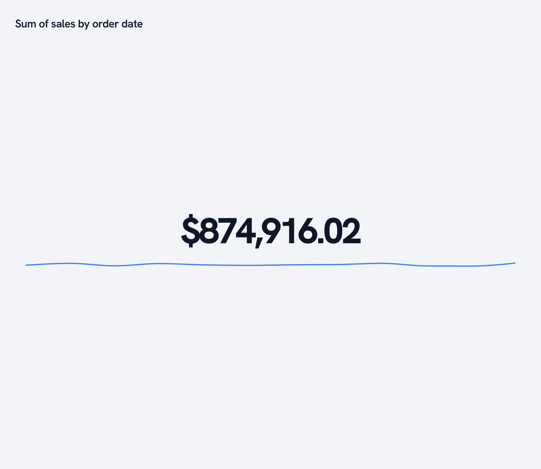
One number, big, with a sparkline underneath for context. The first card on most dashboards.
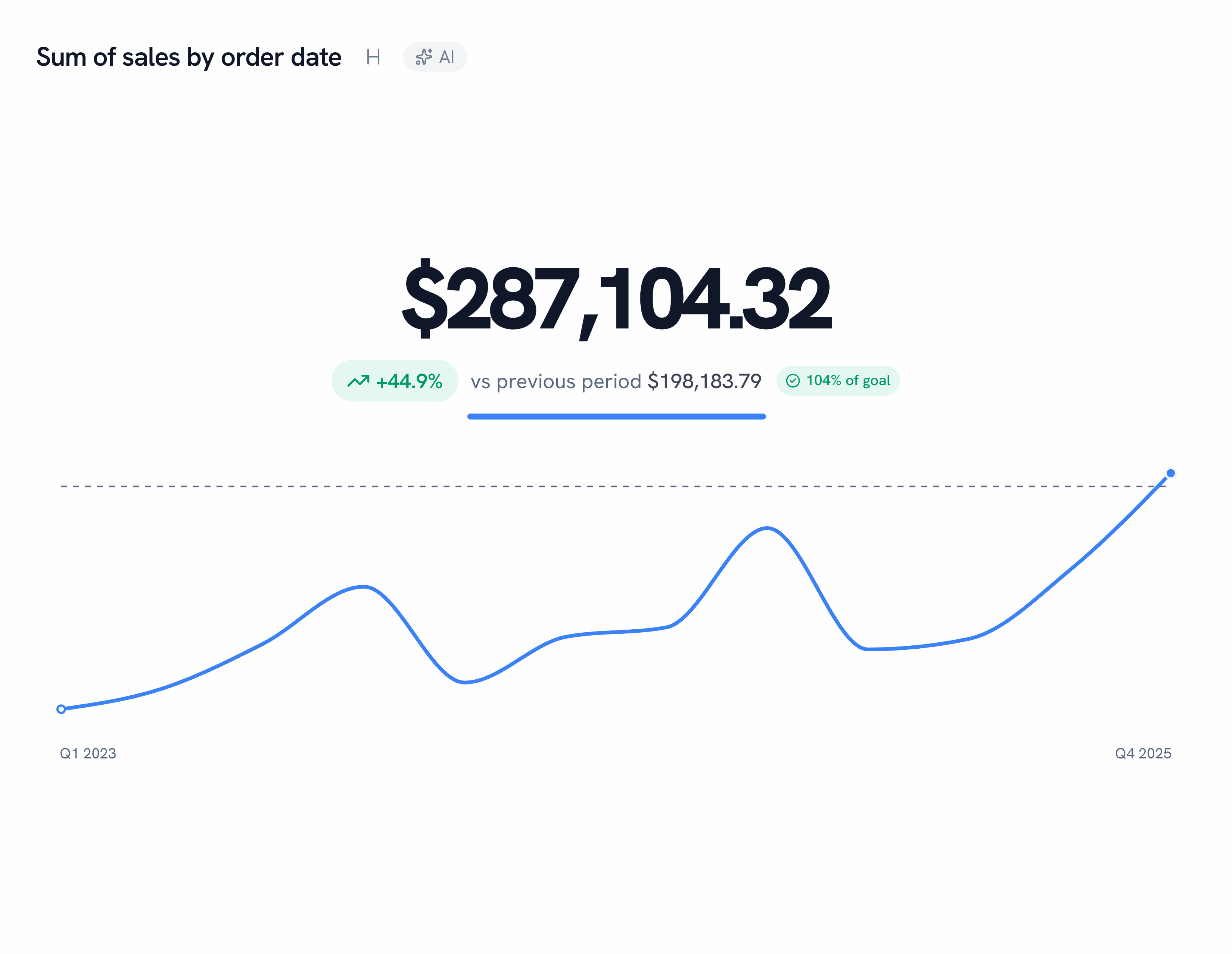
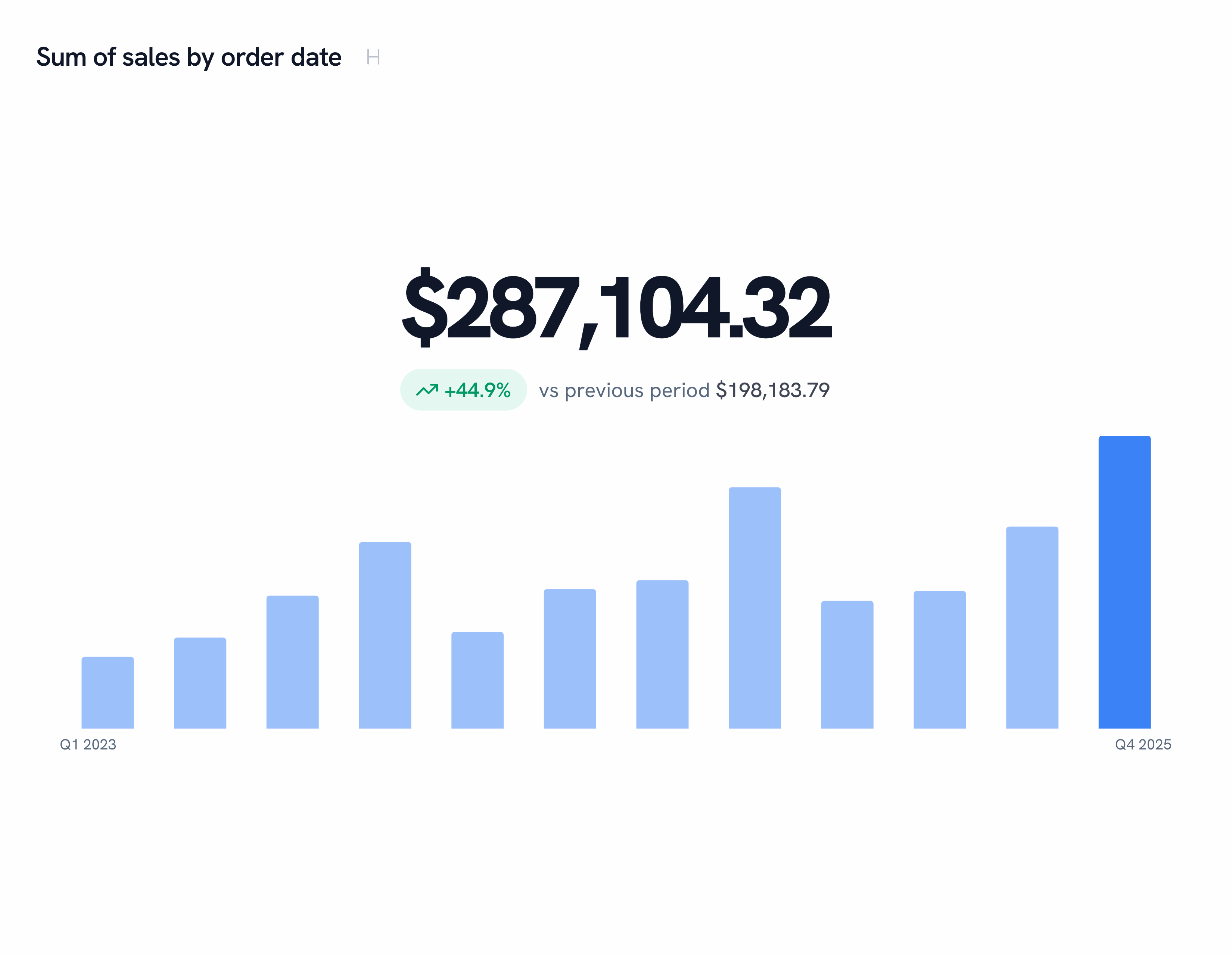
The sparkline underneath comes in three styles. Bars, for when each period stands on its own:
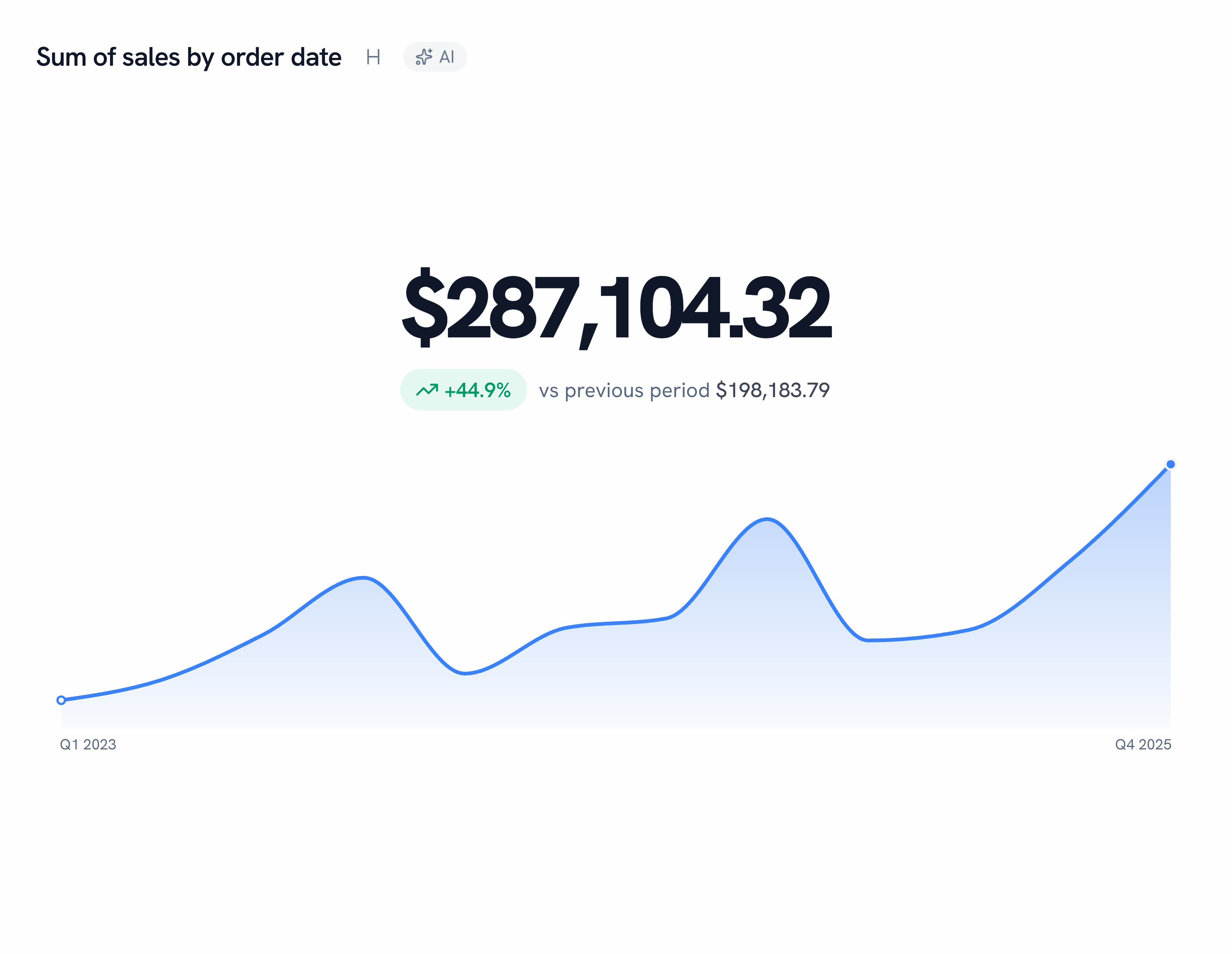
And area, for when the volume under the line is the point:
Specialty
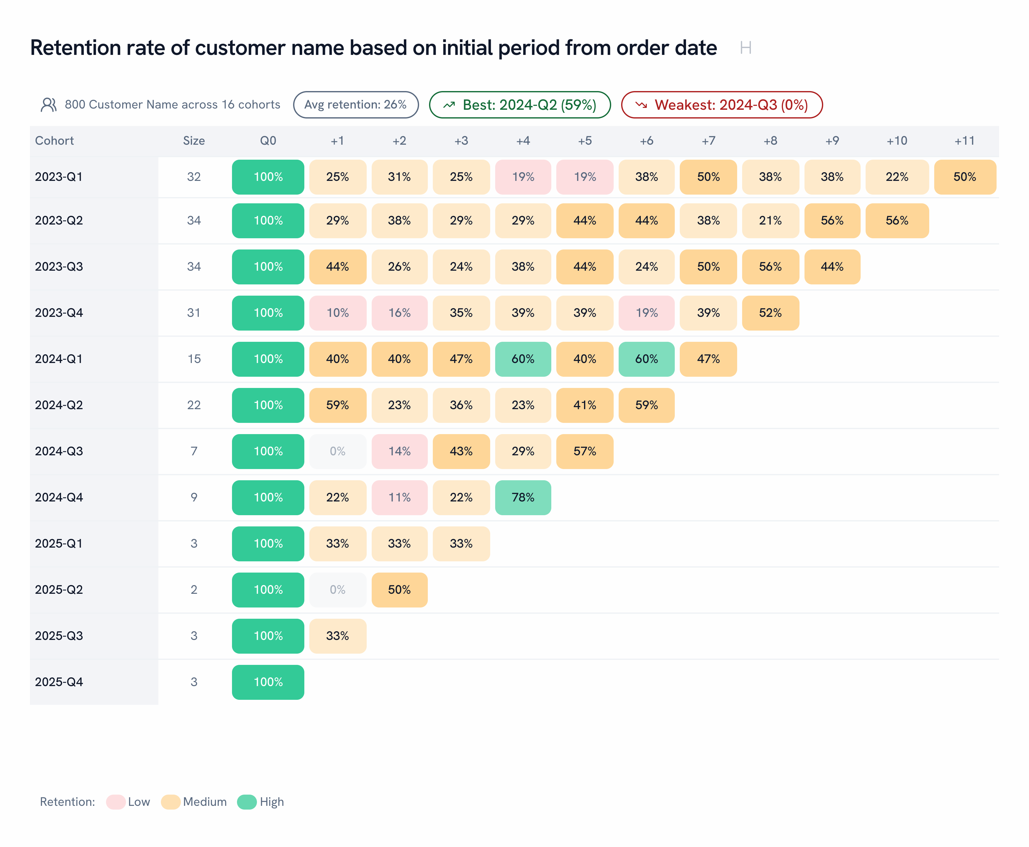
Retention
Cohorts down the side, periods across the top. Golden calls out your best and worst cohort before you go looking.
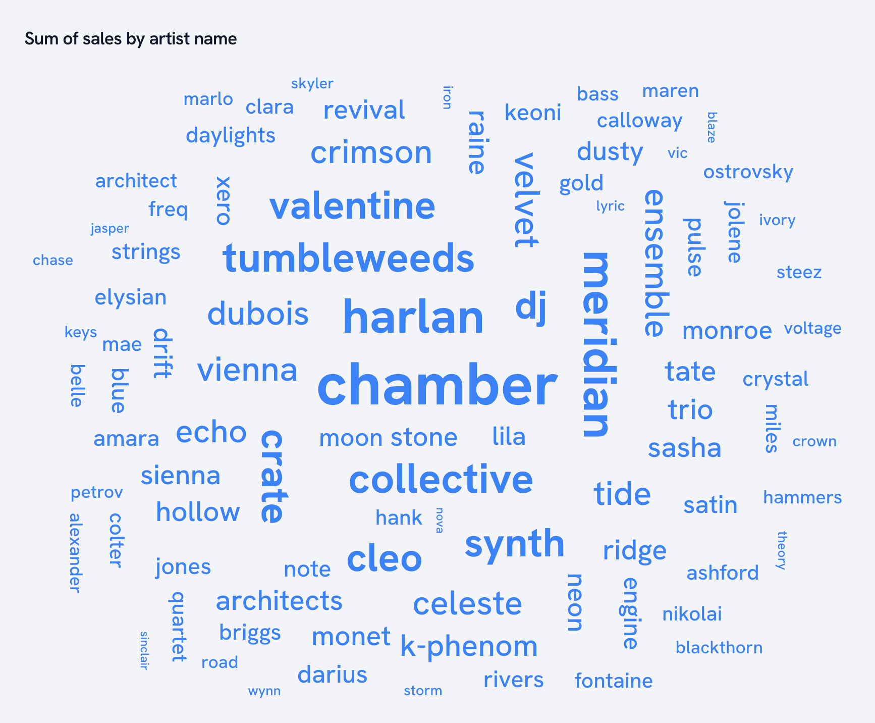
Word cloud
Words sized by a measure. Every artist, sized by sales.
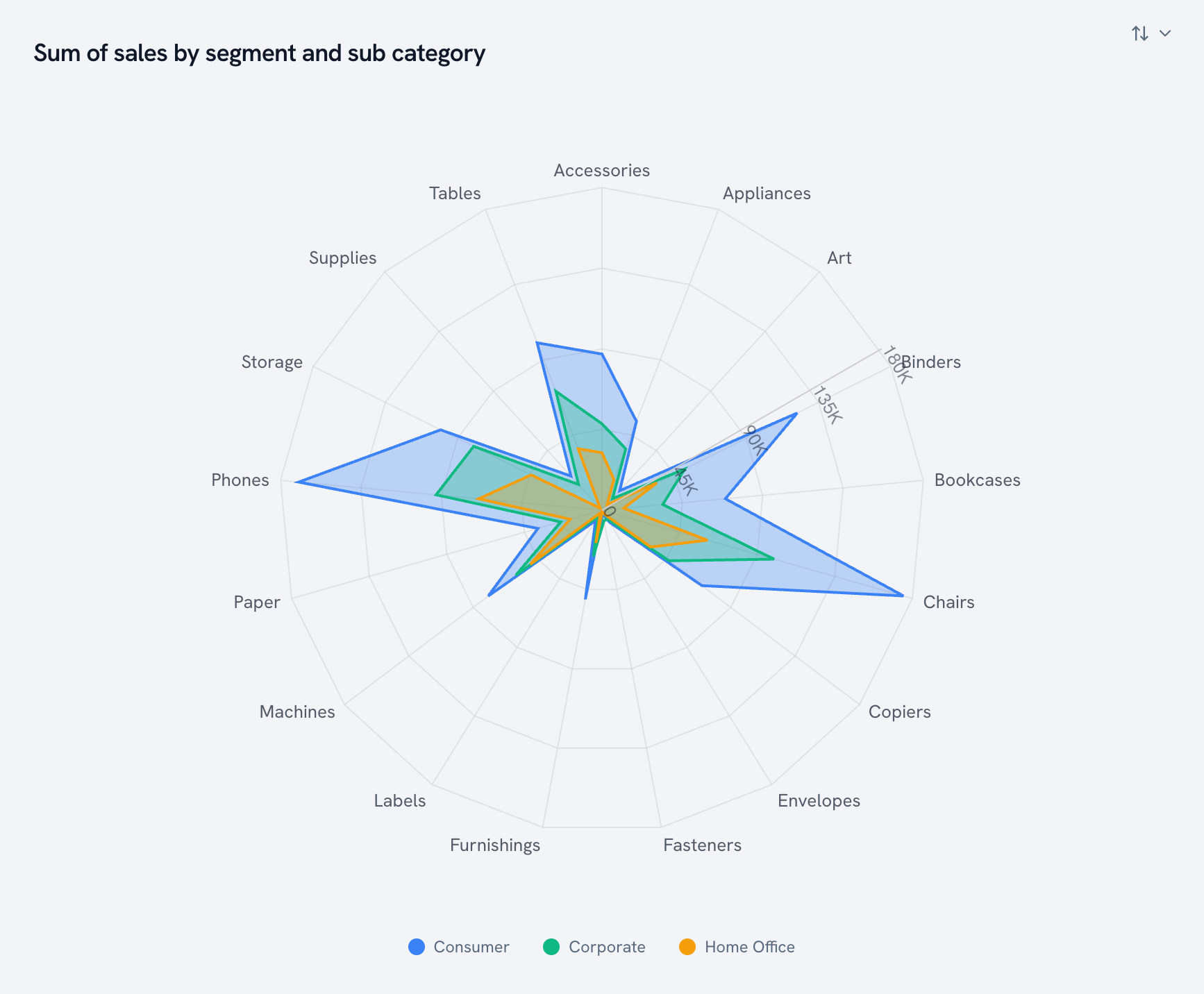
Radial chart
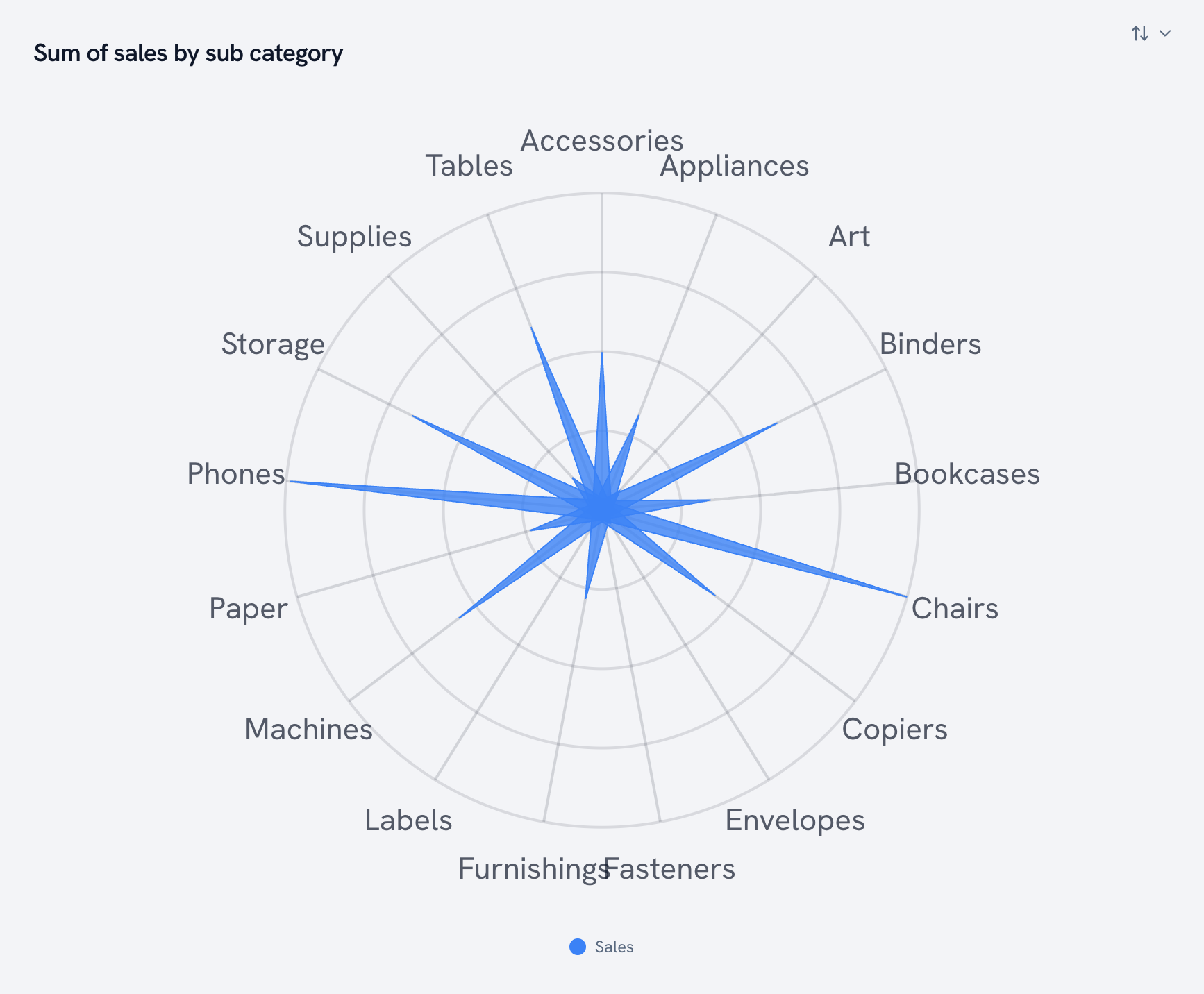
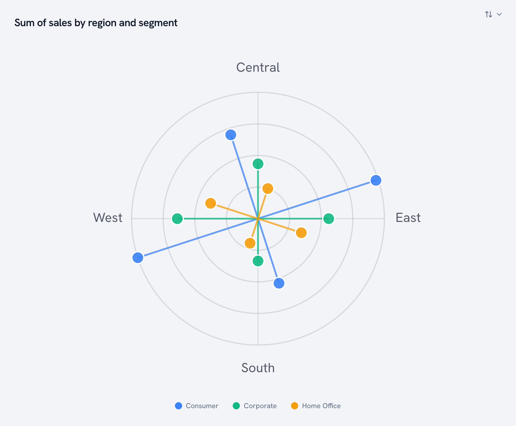
Our most flexible chart. One chart type, five shapes.
Radar. Every axis around a circle, one polygon per series.
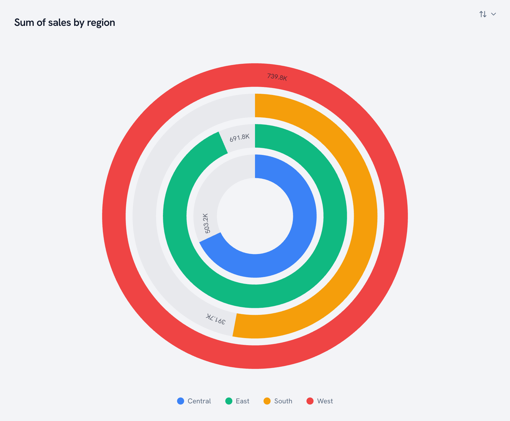
Radial bar. Concentric arcs, one per category.
Stellar. Spikes out from the center. It looks like a star chart because it kind of is one.
Radial lollipop. Lollipops arranged in a circle, one color per series.
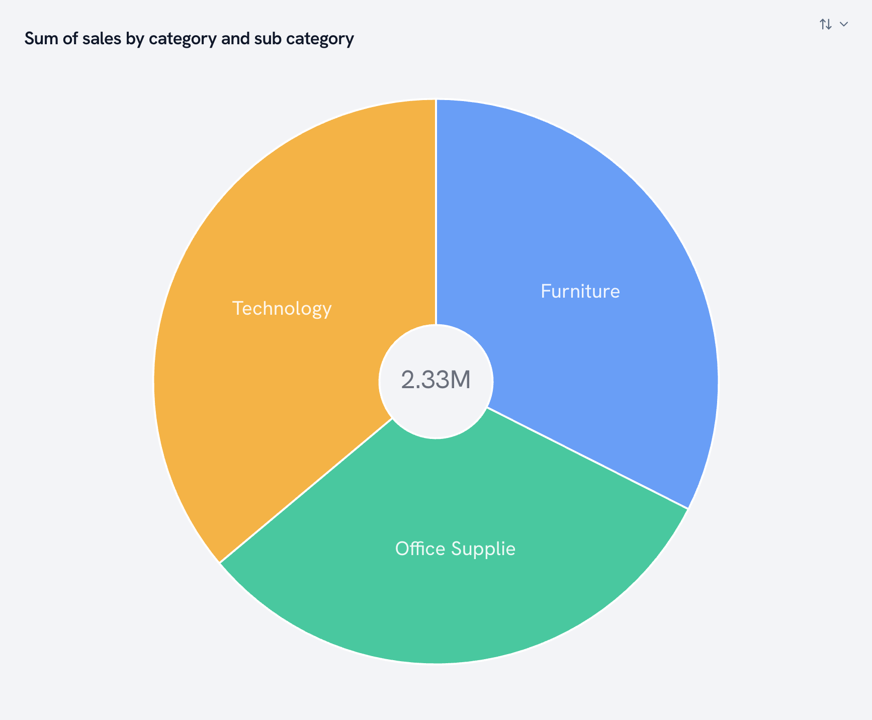
Sunburst. Hierarchies as rings, from the center out.
Modifiers: one switch, a different chart
Some of the most useful views in Golden aren't separate chart types. They're a toggle on a chart you already built.
Quadrant mode
Flip it on and the scatter splits into four labeled zones, at the average, the median, or a line you set. High volume and high price in the top right. Classical sits alone in the bottom left.
Forecast
One click and the line keeps going, with a confidence band so you know how sure it is.
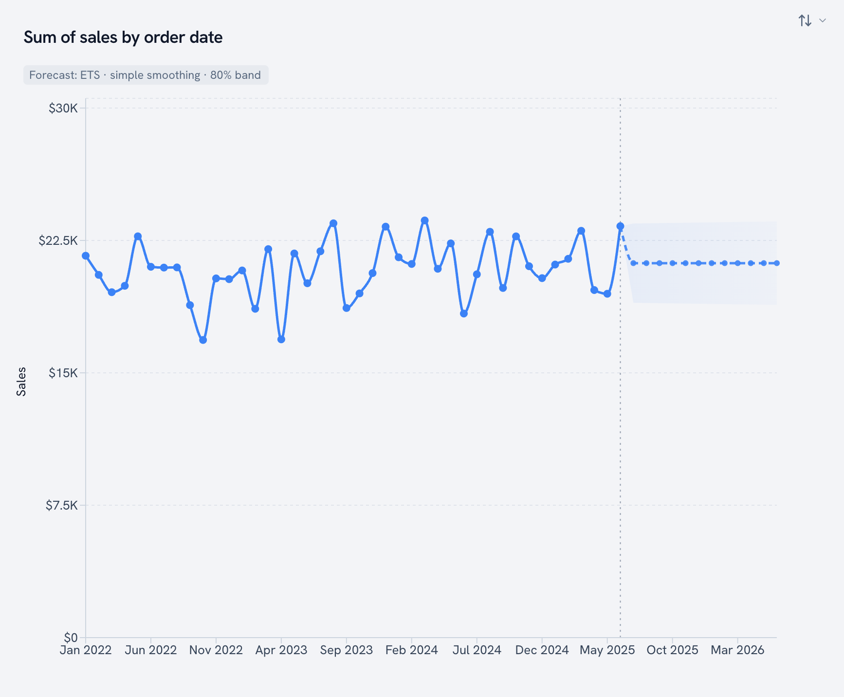
The rest you've already seen above: funnel styles, range bar vs. dumbbell, pie vs. donut, the five radial shapes, and share-of-row on survey bars. Bar charts also scroll or fit to the view, and any chart splits into a trellis of small multiples.
Dashboard cards
Charts are half a dashboard. The other half is the cards that tell you, at a glance, whether things are OK. Golden has 22 of them, and most come in more than one style.
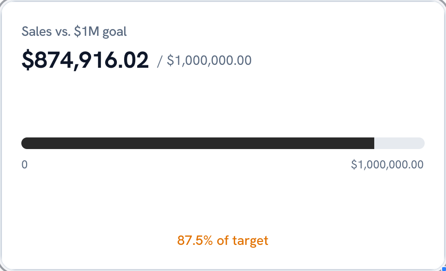
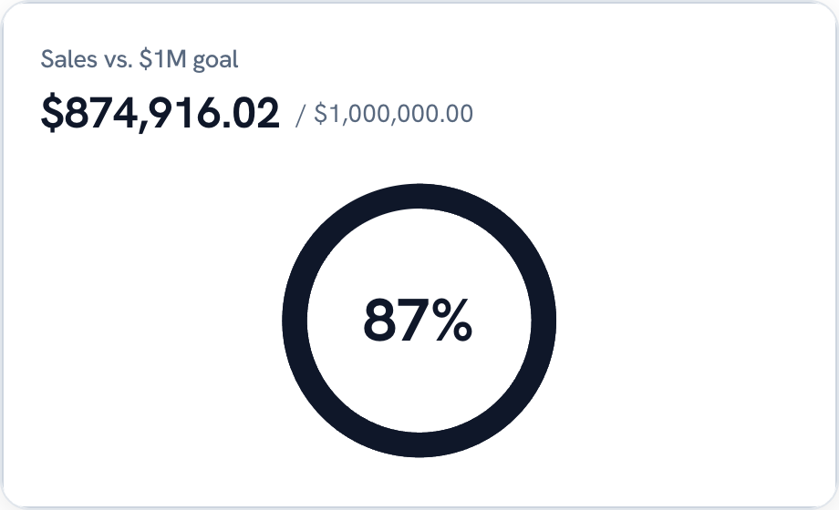
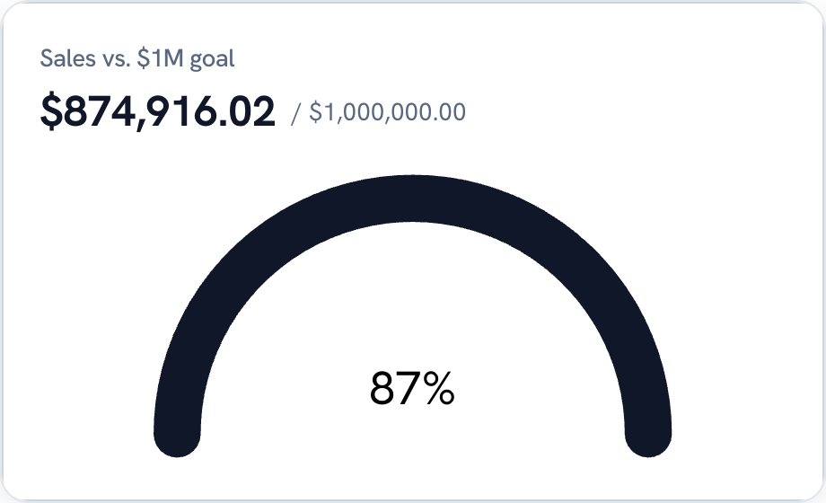
Progress
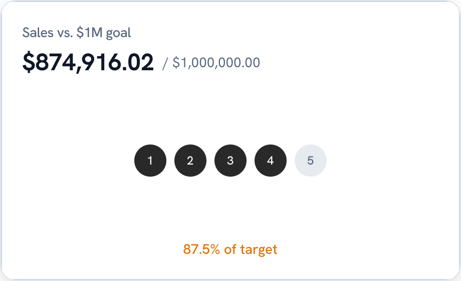
How close are you to the goal? Four ways to show it.
Stat comparison
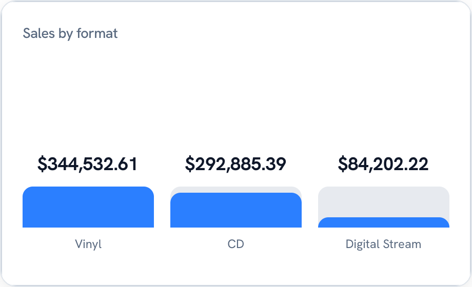
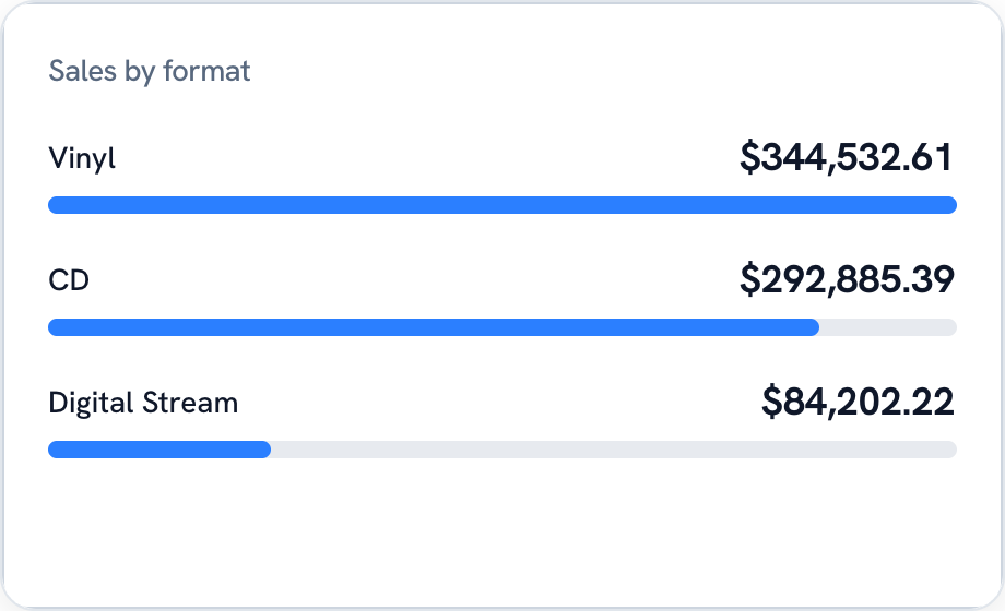
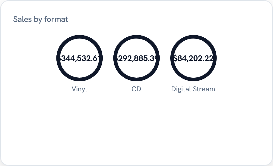
A few numbers side by side, as bars, a list or rings.
Comparison
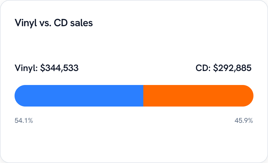
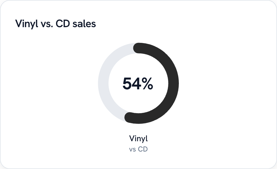
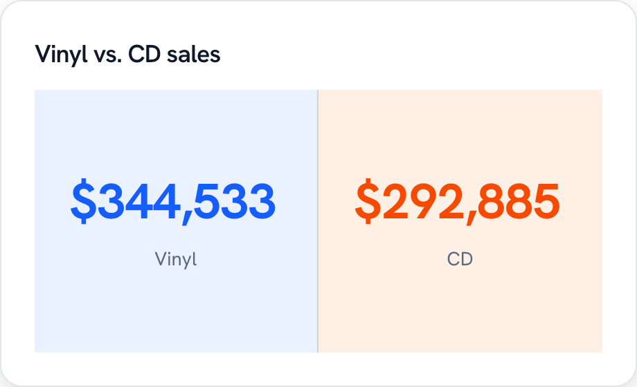
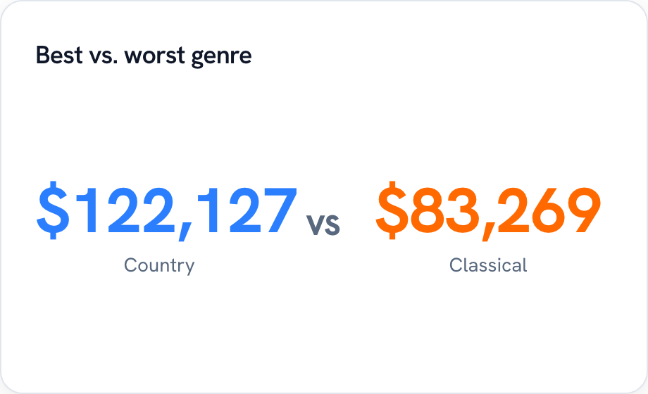
Two values head to head. Vinyl vs. CD, or best vs. worst genre (Golden re-picks the winner and loser every time a filter changes).
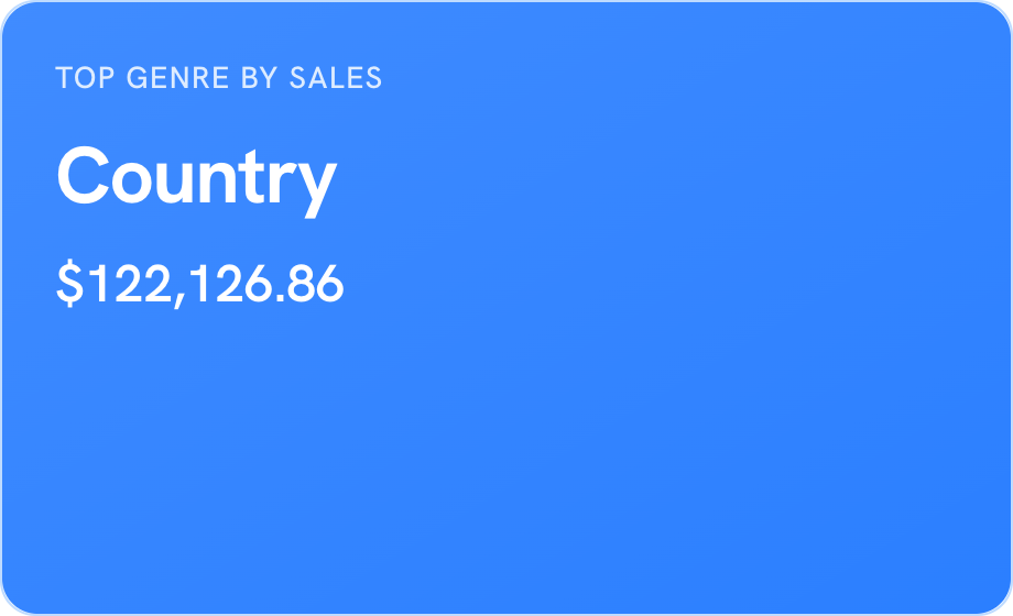
Highlight
The one fact you want people to walk away with, in a card that's hard to miss.
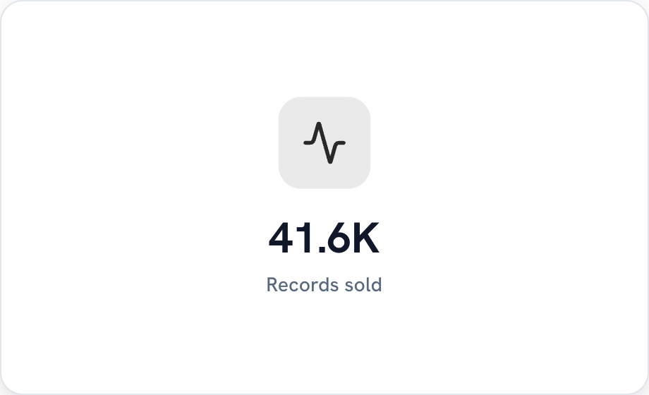
Icon metric
A number, a label and an icon. Simple, and it makes a row of KPIs easy to scan.
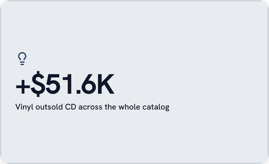
Callout and quote
For the words around the numbers.

Plus the layout pieces that hold a dashboard together: text, headings, dividers, sections, images, timelines, status bars and filters.
So which one should you use?
Honestly, you usually don't have to decide. Drag your fields on and Golden suggests a chart that fits them. Ask the AI Analyst for "sales by genre as a waterfall" and it builds it.
But it's nice to know the whole toolbox is there. 41 charts, the modifiers, the cards. Go make something.