Open a dataset. Get the findings first.
Automated discovery tests relationships across a dataset and ranks the findings that hold up statistically. Golden shows the numbers behind each result and turns any finding into a dashboard.
The good chart is usually chart eleven
Every new dataset starts the same way. Drag a measure onto a chart. Slice it by region. Then product. Then region and product together, hunting for the one cut that explains something.
Most of those charts go nowhere. The interesting one shows up somewhere around attempt eleven, if you had the afternoon to get there.
Golden does the first pass for you
Golden runs those eleven attempts, and a few hundred more, the moment you connect your data. It keeps only the findings the statistics can back up and ranks them by how strong they are.
You start with a list of what's actually going on in your data, evidence attached, and decide which thread to pull.
How it works
Connect your data
Upload a file, connect a Google Sheet, or point Golden at your warehouse. Discover profiles every field first: type, quality, which columns are places, which are dates.
Golden tests the patterns
About 30 kinds of probes run against your data. Which factor drives a rate. Which segments lose money. What's top-heavy, what's seasonal, which combinations compound into something worse than either alone.
It throws out what can't hold up
A segment needs at least 50 rows before it counts. Every test in a run is corrected for false discoveries, so checking 200 cuts doesn't manufacture 10 fake wins. Columns that just restate the outcome get filtered out, and blanks never become a finding.
You read the evidence
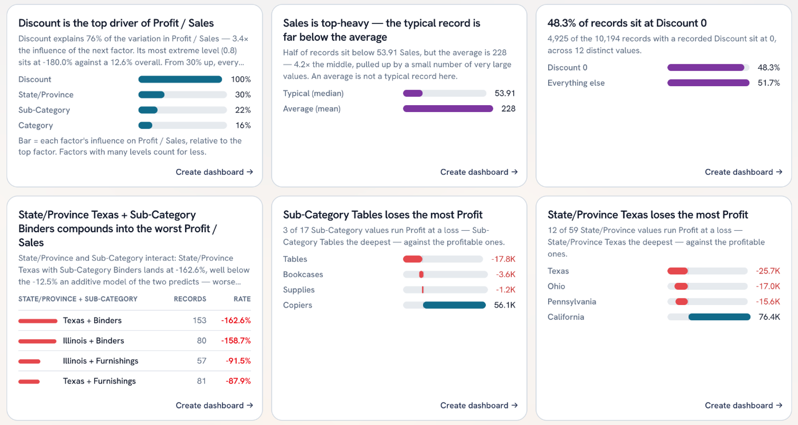
Each card says it in plain language, with the numbers attached. "Discount explains 76% of the variation in Profit / Sales." "Half of records sit below 53.91 in Sales, but the average is 228." The chart comes from the kind of finding: a loss gets a diverging bar, a combination gets a ranked table.
Turn it into a dashboard
Every finding has a Create dashboard button. One click and it becomes a board you can filter, restyle, and share.
What you get
- 01Ranked findings across every field in about a second (a 10,194-row retail dataset took 0.5s)
- 02Key questions that build whole dashboards: what moved over time, where it's concentrated, what sells together
- 03Driver findings that check for confounders before they crown a winner
- 04Statistical guardrails written into the code, so a prompt can't talk its way past them
Spend your time on the second question
The insight you need is often sitting in the data on day one. Finding it was the expensive part. When the first pass is done for you, you get to spend the afternoon on the follow-up, and that's where analysis gets fun.
See what's hiding in your data
Sign up for early access and point Golden at a dataset you know well. Check whether it finds what you'd find.