From raw responses to the gap that matters
Survey analytics turns raw responses into comparable scores, segments, and themes. Golden reshapes the export, builds accessible Likert views, and ranks the gaps worth investigating.
The hard part is the spreadsheet
Survey exports are built for the survey tool. One column per question, two extra header rows, agreement scales stored as text. Before you can chart a single answer, you're unpivoting.
Then you build the diverging bars by hand, pick colors, line up neutral, and do it all again next quarter.
Connect the export. Golden builds the board.
Golden recognizes survey data on sight, reshapes it, and builds the Likert views, segment filters, and NPS scorecards you'd otherwise build by hand.
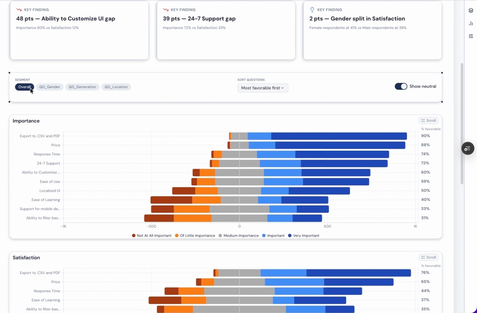
Then it goes a step further and ranks the gaps between what respondents care about and how well you're delivering it. Two clicks from raw export to your priority list.
How it works
Connect the export
Golden recognizes survey data, including the extra header rows Qualtrics and SurveyMonkey add, and reshapes wide responses into a shape you can actually analyze.
Get the right charts
Likert questions become diverging stacked bars, strongest answers on the outside, in an orange-to-blue palette that holds up for color-blind readers. % favorable is a real measure, so you can sort by it, filter on it, and drop it in a KPI tile.
Slice by who answered
Pick a segment (gender, generation, location, tenure) and the board splits by it. Sort questions by favorable, unfavorable, or survey order. Hide neutral and agreement lines up at the center, so top-2-box reads straight off the bar.
Find the priority gaps
When a survey rates the same statements twice, say importance and satisfaction, Golden joins them and ranks the gaps in points. "Ability to customize UI matters more than it delivers." That's your roadmap, sorted.
Go past Likert
NPS with promoters, passives, and detractors. Key drivers of satisfaction. Open-text themes. Movement between survey waves. Response quality checks, so the speeders don't skew the story.
What you get
- 01Automatic detection and reshaping of wide survey exports
- 02Likert palettes tested against color-vision simulation
- 03Importance vs. satisfaction gaps, ranked in points
- 04NPS dashboards without the setup
Spend the time on what people said
Survey analysis has real craft to it, and the people who teach it build beautiful dashboards. Every analyst shouldn't have to rebuild that craft from scratch for every survey. Golden builds the board, and you get to read what your respondents are telling you.
Bring your next survey
Sign up for early access and go from export to insight in two clicks.