See where the business actually lives
Location analytics shows where a measure is concentrated, growing, or falling behind. Pick a measure and geography, and Golden builds the map and identifies the places worth a closer look.
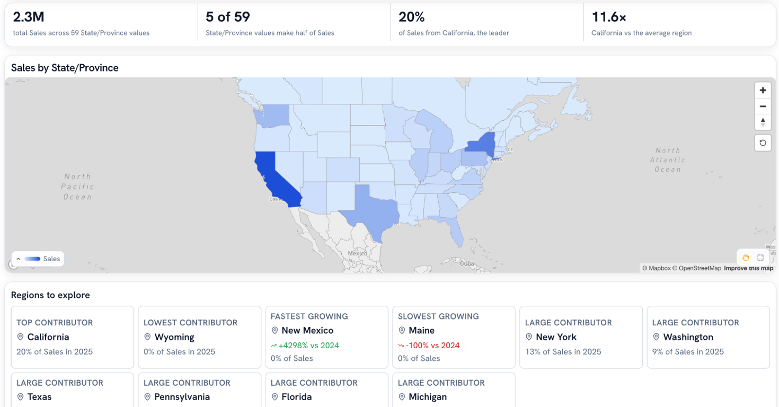
A pretty map answers almost nothing
California is dark blue. Sure. Is that because California is huge, or because something's working there? Which states are growing? Which one is beating the states around it?
A filled map looks great on a slide. Then someone asks one of those questions and you're back in a spreadsheet.
A map that answers the follow-up questions
Golden builds a whole board around your geography: how concentrated the measure is, who leads, who's growing, who's slipping, and who's beating the places around them.
Click any region and it explains what drove the number, so the map becomes the start of the analysis instead of the end of the slide.
How it works
Pick a measure and a level
Golden recognizes geography from the values themselves: country, state, county, city, ZIP. Choose Sales by State, pick a time grain, hit Explore.
Read the concentration
Four numbers up top: the total, how many places make up half of it, the leader's share, and how far the leader sits above the average region. In one retail example, 5 of 59 states make half of sales, and California runs 11.6x the average.
Explore the regions
Golden pulls out the top contributor, the lowest, the fastest growing, and the slowest growing, each a different place. Growth compares like with like, year over year when there's enough history. Click any of them and the whole board filters to it.
Compare against the neighbors
At state and county level, Golden checks each place against the ones it borders. "California has Sales of 457.7K, against a median of 17.4K across the 3 states it borders." That's the line that tells you whether it's the market or the team.
Explain what drove it
Select a region and Golden breaks its change down by product, city, and everything else in the data, so you see exactly which pieces moved the number.
What you get
- 01Filled maps at country, state, county, and ZIP level (ZIP is about 33,000 shapes, so it streams in as tiles)
- 02Radius filters you can type: "within 100 miles of Chicago"
- 03Ambiguous places like Springfield ask which one you meant instead of guessing
- 04Ratio measures like margin compared against the overall rate, so a small region with a great margin still shows up
Geography decisions are expensive
Which territories to staff. Where the next store goes. Whether a region's slide is real or just noise. Those calls deserve more than a pretty map and a hunch.
Put your data on the map
Sign up for early access and see where your business is concentrated in about a minute.