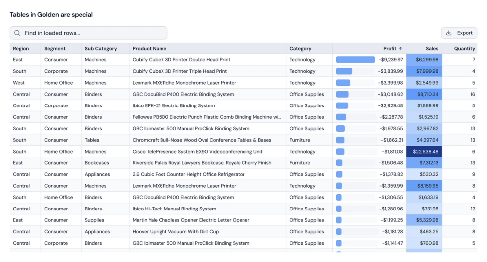
Everybody loves a good visualization. A well-designed chart can reveal a pattern in seconds, explain a complicated idea, or make an important number impossible to miss.
But sometimes, you just want to see the data.
Tables are one of the most useful ways to explore and communicate information. They preserve detail. They make comparisons precise. They let you scan, sort, select, and copy the exact values behind an analysis.
Most analytics tools support tables. Supporting them is the easy part. Making them genuinely useful is harder.
In traditional BI tools, building the table you actually want can involve awkward workarounds, custom calculations, or third-party extensions. We wanted tables in Golden to feel much more natural: powerful enough for serious analysis, but as fluid and familiar as working in a spreadsheet.
No extensions. No special tricks. Just tables that work.
Explore the entire result
Golden tables are virtualized, which means they render only the rows currently visible on screen. That keeps scrolling smooth, even when you are working with tens of thousands of rows.
You can explore up to 50,000 rows without turning the browser into the bottleneck. Sorting happens in the query, so you are sorting the result—not merely rearranging the rows that happened to load first.
It feels less like viewing a static report and more like working directly with the data.
Move naturally between summary and detail
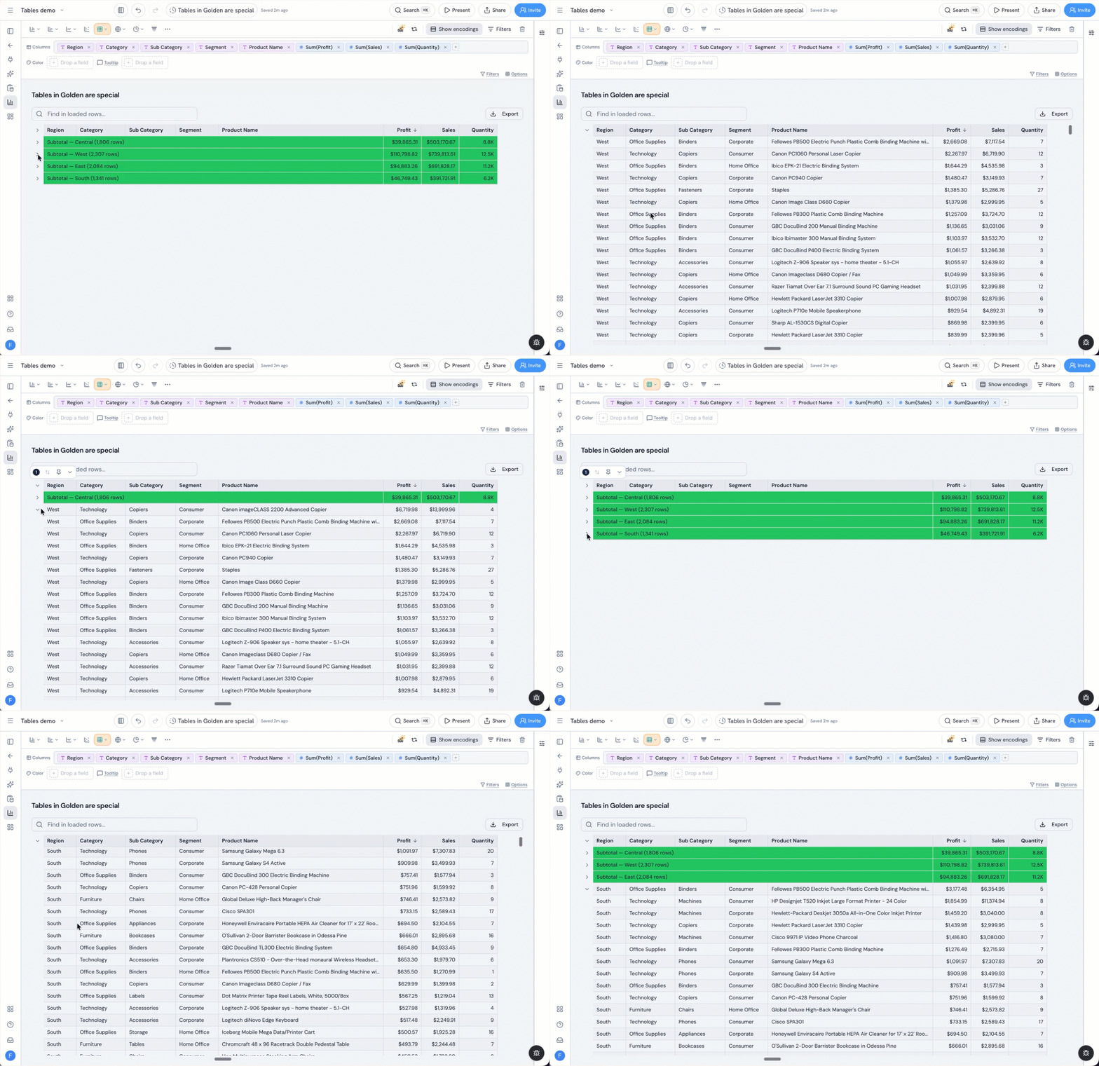
Group a table by any dimension and Golden creates subtotals for each group. You can expand and collapse those groups to move between a high-level summary and the underlying records.
Totals are calculated by the warehouse over the full result set. That matters because different measures need different calculations: an average should remain an average, rather than becoming a sum of the values currently visible in the browser.
Grand totals, row totals, and subtotals therefore reflect the analysis you actually asked for.
Select cells and get an immediate answer
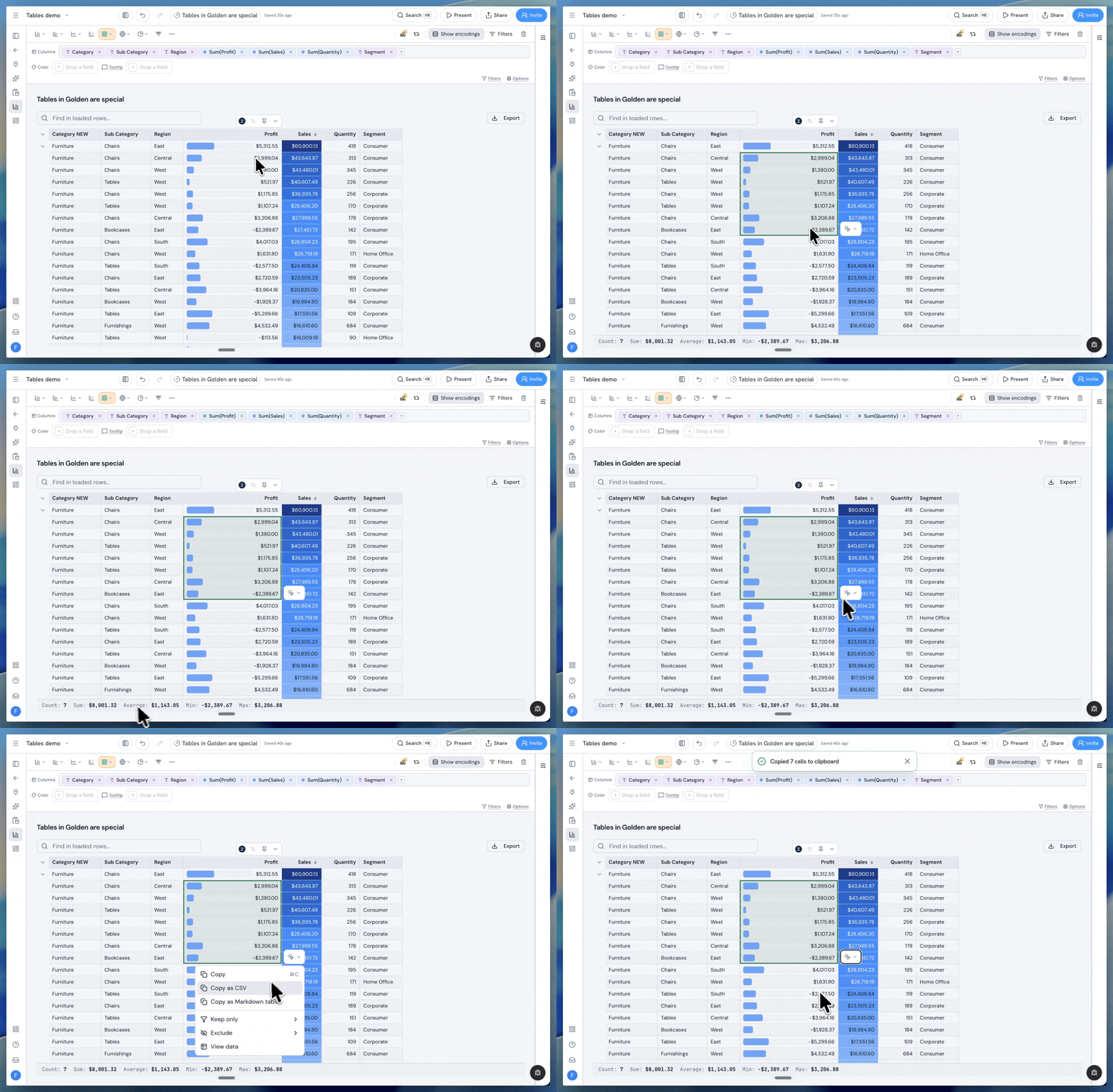
Select one or more cells and Golden automatically calculates useful statistics such as the count, sum, and average.
The status bar understands formatting and units. Select values from a currency column and the result remains currency. Select cells from measures with different units and Golden keeps their calculations separate rather than combining values that do not belong together.
This turns the table into an active analytical surface. You can test an idea or answer a quick question without creating another calculation or visualization.
Format each column on its own terms
Different columns communicate different things, so they should not all be formatted in the same way.
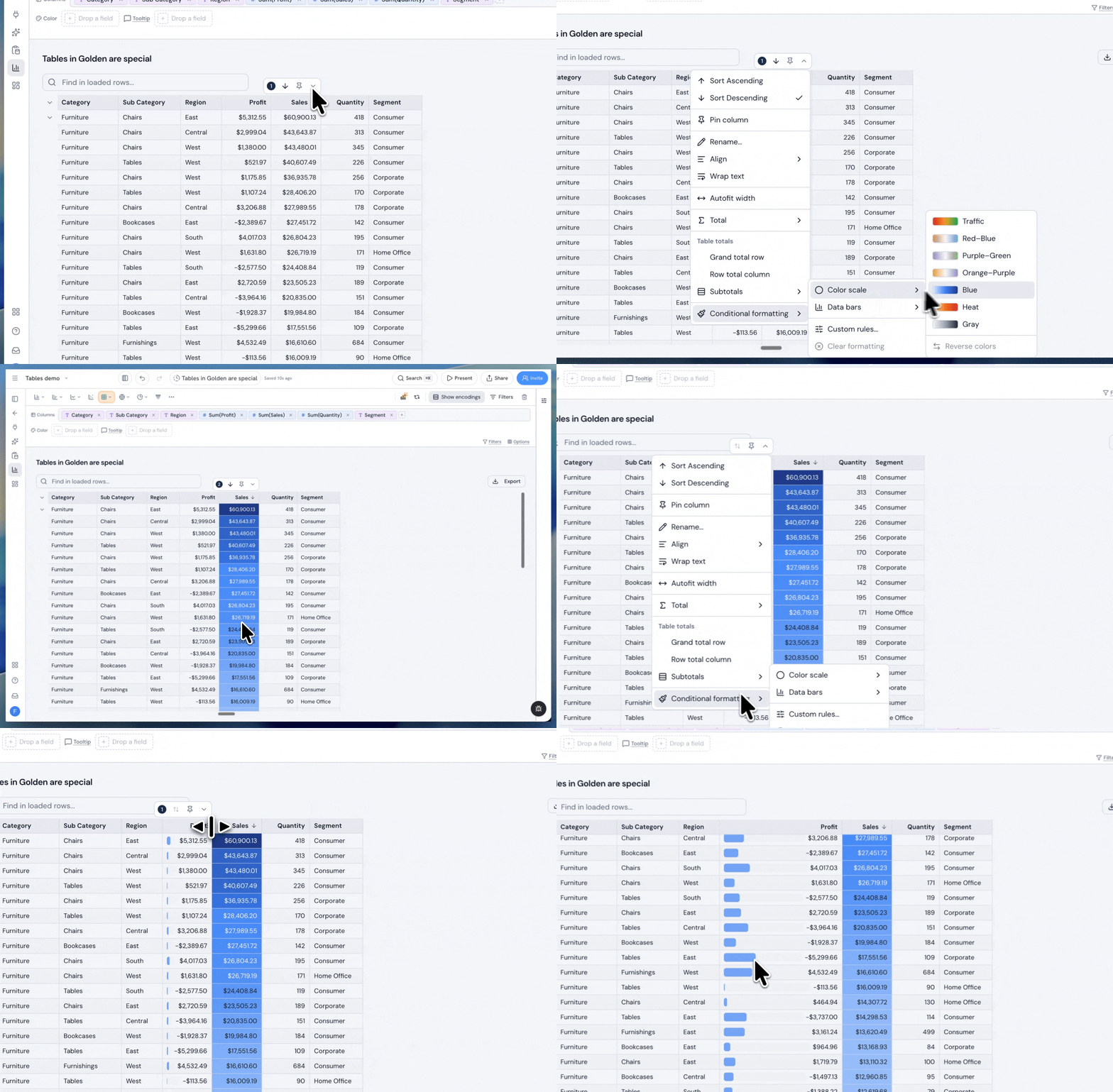
In Golden, conditional formatting belongs to the individual column. You can add color scales, define formatting rules, show in-cell bars, or use sparklines to reveal trends without losing the precision of the underlying numbers.
Each column has its own toolbar for sorting, formatting, and applying visual rules. Columns with settings are clearly marked, and those settings can be reset with a click.
You can also rename a column directly from its header. Double-click, enter the label you want, and continue working.
Arrange the table once
Resize columns, change their order, pin the fields you need, and choose a sort. Golden saves that layout with the analysis, so it is still there when you return.
Column widths begin at sensible sizes based on their contents, while pinning keeps important dimensions or totals visible as you move across a wide result.
These details may sound small, but together they make the difference between a table you continually fight and one that stays out of your way.
Copy data wherever it needs to go
Select a range of cells and copy it in the format that fits your next step.
A regular copy produces tab-separated values ready for Excel or Google Sheets. You can also copy the selection as CSV or as a complete Markdown table for a document, README, Notion page, or chat message.
CSV and Excel export are available when you need the larger result.
The table is not an endpoint. It is a useful bridge between your analysis and the rest of your work.
Use the same table everywhere
The table you build in an analysis is the table that appears on a dashboard, in a story, or inside a document—including its formatting and interactive behavior.
You do not have to recreate the design or accept a simplified dashboard version. Search, sorting, resizing, pinning, drilling, cross-filtering, selection, and formatting remain available where they make sense.
Fast enough to feel simple
There is substantial engineering behind that simplicity.
Golden’s table engine avoids loading every row into the page at once. We also eliminated duplicate result fetching, cutting warehouse round trips and the amount of data transferred roughly in half in our large-table testing.
We benchmarked the grid against a live Snowflake-backed table to establish a practical 50,000-row ceiling. If a search applies only to the rows currently available, Golden says so plainly.
The goal is predictable performance rather than surprising failure.
A spreadsheet experience built for analytics
Charts will always be central to business intelligence. But tables are where many people verify results, investigate details, compare exact values, and decide what to do next.
That is why tables in Golden are not an afterthought or a fallback visualization. They combine the immediacy of a spreadsheet with the scale, calculations, and connected workflows of a modern analytics platform.
All the useful parts of Excel, built directly into Golden—with the right analytics superpowers included.